Saturation curves: reading the bend and its confidence interval
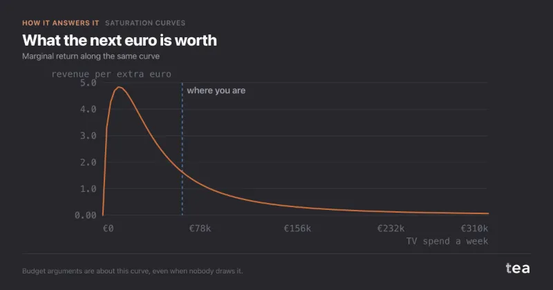
Every media plan assumes a curve like this one. Almost none of them have ever drawn it.
The line is what TV adds to weekly revenue at each level of weekly spend, fitted on two years of a grocery retailer's data. It climbs steeply, then it bends, then it flattens. That is the whole of diminishing returns in one picture.
Filed under Saturation Curves | Permalink