ea

Analyses/Media Effectiveness Path/Saturation Curves

What the next euro of a channel buys.

Saturation Curves fits one response curve per channel: steep while the first euros reach new people, flat once they reach the same people again. The question it answers is never how good a channel is, but how much the next euro buys at the level you run it.

Answers Is the next euro in this channel still worth it? Needs Weekly KPI, spend per channel at many levels Hands back A curve per channel, its bend, three scenarios

Paid social, three times past its bend

revenue the channel adds each week, by weekly spend, €k
  • Fitted response
  • 95% interval
The bend€15k a week95% interval €12.5k to €18.5k
Where they spent€46k a weekthree times the bend
The next euro€0.37at €46k, against an average of €2.44

The paid social of a skincare brand in Germany and Austria, from the first example below. A composite case: your file draws its own curve, channel by channel, with its interval.

01

What it is for

Diminishing returns are not in dispute: the hundredth spot of the week reaches people the first ninety-nine already reached. What a plan needs is where the flattening starts for each channel, and how sure the file is about it.

Capping a channel

A channel past its bend is still selling, which is why nobody cuts it. The curve says what the last euro bought, and whether that covers its own cost at your margin.

Defending or refusing an increase

A bigger budget for one channel is a claim about the part of the curve you have not bought yet. The curve says whether the file has seen that part, or whether the formula is guessing.

Feeding the allocation

Moving money between channels means comparing slopes, not averages. One curve per channel, read where each one runs, is what a reallocation is computed from.

02

How to read it

One block per channel when the file has several. The fit beside the name, three cards that put a spend on the curve, the curve itself and the check of the fit. Read them in this order.

Paid social
Model Confidence 71.0%1 A · Conservative €8k2 B · Neutral €15k3 C · Aggressive €23k4

Response saturation curve

Model Fit

  1. The fit, R². How much of the weekly KPI the model explains. With several spend columns every channel is fitted in one model, so this number belongs to the model and is the same on every block. It says the curves are worth reading, not that this one is right.
  2. Conservative, half the bend. Little of the ceiling has been delivered yet, and each euro here still buys close to the most it ever will. The level for a scarce budget.
  3. Neutral, the bend. The half-saturation point: the spend at which the channel has given half of what it can. Past it each euro buys less than the one before. It is the number to quote, and the one whose interval to ask for.
  4. Aggressive, one and a half times the bend. More volume, at a return per euro that is visibly lower. Justified when volume is the goal. Each card also prints the output at that level, so the three can be compared in the KPI’s own unit.

03

Where it sits in the analysis

Saturation Curves is the second step of the Media Effectiveness Path, after Lag & Carryover. The order matters: a curve fitted on spend as booked reads the tail of a slow channel as weakness, so the memory of each channel is measured before its shape.

What it carries forward is one curve per channel. Contribution Decomposition applies it to split the KPI between drivers, and Budget Optimization compares the curves where each channel runs to move the money.

The short version of what the module hands back is on the saturation curves page. This one is about reading the result.

Media Effectiveness Path

  1. Lag & Carryover

    Finds how long a burst keeps working, before anyone tries to measure how big it was.

  2. Saturation Curves this page

    Where each channel stops paying back, fitted as a curve rather than asserted as a rule of thumb.

    Carries forward: saturation curve per channel

  3. Contribution & Driver Decomposition

    What each channel actually contributed across the window, adstock and saturation included.

  4. Budget Optimization

    The same budget, moved. With the conservative scenario for when the plan meets reality.

  5. Geo / Segment MMM optional

    The same model per region or segment, if your file carries one. Where the average hides two different markets.

04

Where it usually misleads

A curve fitting routine always returns a curve, and it always looks like diminishing returns. Whether the file chose that shape or the formula did is the whole question, and R² rarely answers it.

Too few spend levels

A Hill curve has a ceiling, a bend and a sharpness. Two levels of spend pin down two points, and infinitely many curves pass through both: they agree where you bought and disagree everywhere else. The interval stays narrow, because it is conditional on a shape the file never chose. Second example below.

Before the run, the Data Scout counts the distinct spend levels of each channel, flags any under ten, and stops the run when no channel has four. It counts values, not clusters: look at the column too.

The average return read as the next one

Return on ad spend is an average, and it carries all the cheap volume bought at low spend. A channel can show €2.44 of revenue per euro while the last euro returns €0.37. Funding the top of a ROAS ranking overfunds the saturated channels.

The reading under each curve says what the next euro buys at the typical level against the most it ever bought here, and past which spend it falls under a quarter of that.

A bend that cannot place you

A bend at €26k with an interval from €11k to €42k, and a typical spend of €32k. The point estimate says you are past it. The interval says you could be on either side, and a cap set on that is a coin toss with a budget attached.

When the typical spend falls inside the interval on the bend, the reading says the chart cannot tell which side you are on, and to hold the level until the file can.

One channel fitted alone

Regress the KPI on one channel and every other channel’s effect sits in the residual. With a dominant medium in the plan, the smaller channels come back with no curve at all, when what they carry is a curve hidden behind the big one.

With more than one spend column, every channel is fitted in one model, and each curve is what that channel adds once the others are accounted for.

Spend that follows demand

If the high weeks of a channel are always the high weeks of the year, the step between two spend levels is also a step between two seasons. The curve credits the summer to TV, and looks better for it.

Buy some heavy weeks out of season and some light ones in it. Where that cannot be done, measure the channel inside Contribution Decomposition with the season as a control.

A ceiling that is the whole business

Fitted through the origin, a curve says the KPI is zero when the channel is off. On most files it is not, so the curve spends its shape climbing to the organic level and its ceiling is total sales, not what the channel adds.

Curves are fitted on top of an organic baseline by default, and the sentence under each one says which of the two readings its ceiling has.

05

Two examples

One file where the curve changed a budget, one where it fitted neatly and meant nothing. The difference was in the spend column, not in the model.

Helps

Paid social past the bend

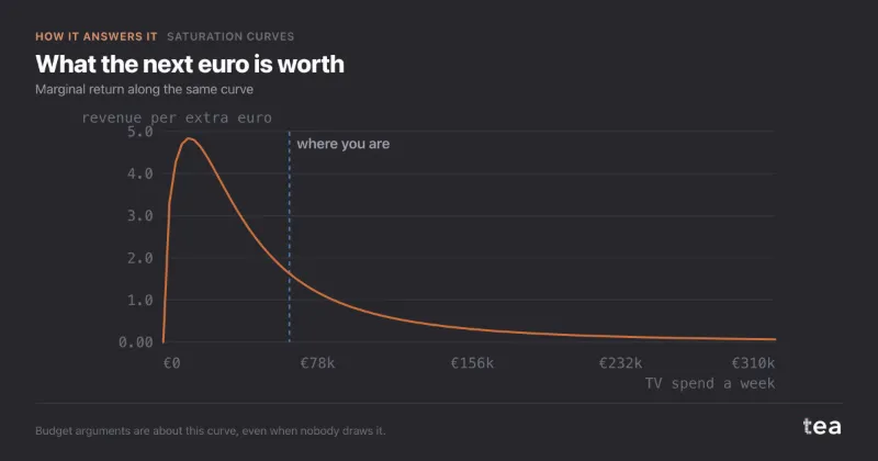
A skincare brand selling online in Germany and Austria had let paid social creep from about €20k a week to €46k, while platform ROAS fell from about 4 to 2.4. The team blamed creative fatigue. Over 92 weeks spend had ranged from €6k to €62k, for reasons that had little to do with demand: tests, launches, a capped account.

The curve fitted at R² 0.71, with the bend at €15k a week and an interval from €12.5k to €18.5k. Spend sat at three times the bend, and the last euro returned €0.37 of revenue, 22 cents of profit at a 60% margin. A cut to €32k cost about 1.9% of revenue and left the brand roughly €8.5k a week better off. A quarter later revenue was 1.6% below forecast, inside its interval, and ROAS was back at 3.2.

What the next euro bought, by weekly spend

€ of revenue per extra €

At a 60% margin a euro of social pays for itself above €1.67 of revenue. That line falls between €26k and €32k, which is why the profit-maximising level sat near €27k.
Does not help

TV bought at two spend levels

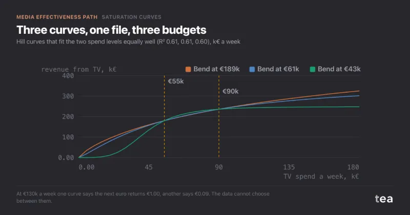
A soft-drinks producer in Portugal had bought TV for two years at about €55k a week from October to May and about €90k in summer, never dark. Seventy weeks between €52k and €58k, thirty-four between €86k and €94k. The brand wanted to go to €130k next summer.

The default fit read well: R² 0.61, a bend at €61k with an interval from €54k to €69k. Let the shape move and the same file was as happy with a bend at €43k or at €189k. On a thirteen-week summer, the extra €520k would buy €603k, €490k or €124k of revenue depending on the curve, and the file could not choose. The answer was a design: six spend levels from €30k to €120k over 26 weeks, not tied to the season, with two dark fortnights.

Read the full case

Three curves, one file

revenue from TV each week, by weekly spend, €k
  • Bend at €189k, R² 0.61
  • Bend at €61k, R² 0.61
  • Bend at €43k, R² 0.60
  • The weeks bought

The three curves agree within a few per cent where TV was bought. From €90k to €130k they buy €603k, €490k and €124k over thirteen weeks.

06

What the charts add to the numbers

A bend is one number, and one number gets quoted without its interval. Each chart puts it back in the context a planner needs: where the money sits on the curve, whether the fit holds, and how the same channel bends in different markets.

Response saturation curve

what the channel adds, by spend

Reads as: where the three scenarios sit on the curve, and how much flatter it is at the third than at the first. The dashed line is the half-saturation point. The curve starts at zero, because a channel that did not run added nothing.

Residuals

prediction errors against the prediction

Reads as: whether the fit is missing something systematic. A cloud with no shape around zero is a curve that has heard the file. A fan or a slope is a driver left out, and a reason to read the bend with more caution than its interval asks for.

Overlaid Saturation Curves

one channel, four regions, % of each curve’s ceiling
  • North · bend €42k
  • Centre · bend €28k
  • South · bend €18k
  • Islands · bend €9k

Reads as: whether the same channel saturates at the same level everywhere. Normalised to each curve’s own ceiling, the bends line up or they do not, and the dots mark each region’s three scenarios. A national budget split in proportion to sales ignores exactly this.

tea, the product

Find the bend in your own channels

A CSV with a date, a KPI and the spend per channel. A curve per channel, its bend and its three scenarios, in minutes, and a plain sentence when the spend never moved enough to answer. Free while in beta, by invitation.

Request a place in the beta

tea, the product

Fifteen econometric analyses on your own CSV: Saturation Curves, saturation curves, elasticities, budget allocation. The diagnostics shown, and a plain sentence when the file cannot answer.

Free while in beta, by invitation.

Request a place in the beta →

Now run it on your own data.

tea runs Saturation Curves and fourteen other analyses on any weekly CSV, in minutes. Free while in beta, by invitation.

Join the beta