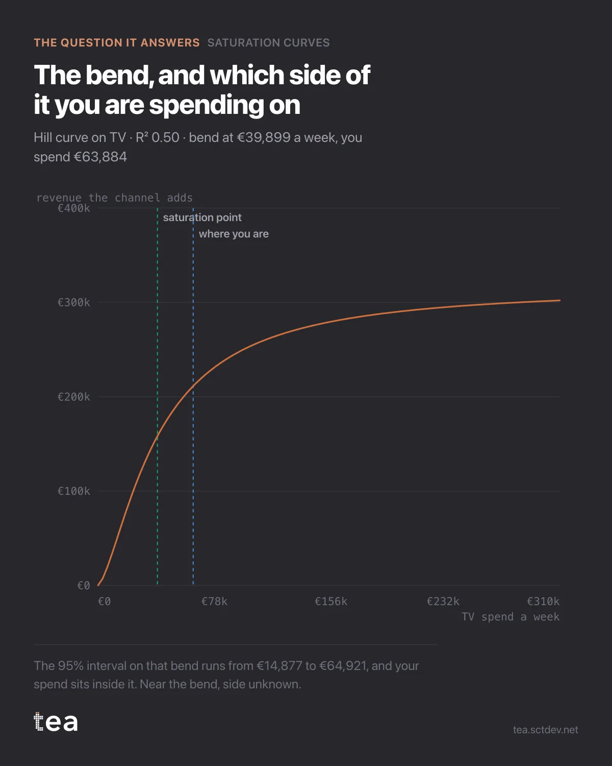
Every media plan assumes a curve like this one. Almost none of them have ever drawn it.
The line is what TV adds to weekly revenue at each level of weekly spend, fitted on two years of a grocery retailer's data. It climbs steeply, then it bends, then it flattens. That is the whole of diminishing returns in one picture.
Two vertical markers matter more than the curve itself. One is the fitted bend, at €39,899 a week. The other is where this business actually spends, at €63,884.
The obvious reading is that they are spending past the bend, and it is the reading I would have written three years ago. It is also not what the data supports, and the difference is the most useful thing on this chart.
The 95% interval on that bend runs from €14,877 to €64,921. The current spend sits inside it. So the honest sentence is: this channel is somewhere near its bend, and this file cannot say which side.
That sentence is worth more than a confident one, because of what would follow from being wrong. Cut a channel that was still climbing and you lose volume you were buying efficiently. Pour money into a channel that had already flattened and you buy almost nothing. Both mistakes are expensive, and both are made every quarter on charts that showed a point estimate and no interval.
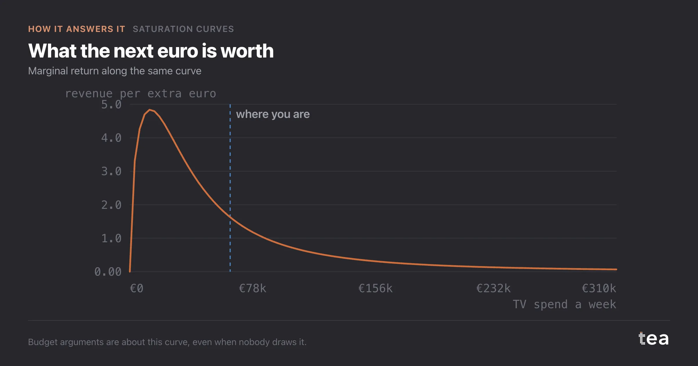
What narrows the interval is not a better optimiser. It is more periods, or fitting the channels together so they stop competing for the same variance. The product says that too, in the conclusion under the chart, rather than offering a plan it cannot support.
The mechanics, briefly. This is a Hill curve: response rises with spend, with a half-saturation point and a shape parameter fitted from the data. An adstock can be applied first, so carryover and saturation are not fighting over the same weeks. The output is the bend, its interval, the marginal return at any level, and a fit quality you can check.
A curve is a much better object to argue with than a number. This one comes with the honesty about where it stops being sure.
If you want to know whether your own curves would come out tight or wide, the answer is almost entirely about variation. A channel whose weekly spend has moved across a wide range, for reasons unrelated to the KPI, is a channel the model can read. A channel that has run at the same level every week for two years has no curve in it, only a point, and no amount of method will produce one.
That is the one thing worth changing in how plans are built. Spending the same amount every week is comfortable, and it is also the decision that makes the next two years unmeasurable.
The chart is the actual output of Saturation Curves in TEA, run on a sample file anyone can download.