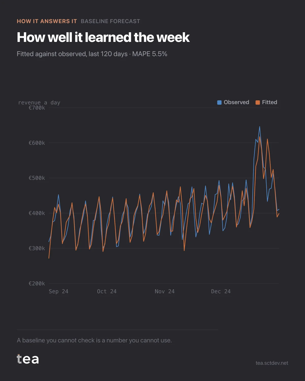
Any model can draw a confident line into the future. The question is whether it could draw the past.
This is the same Holt-Winters baseline as three weeks ago, with the fitted values laid over the last 120 days of actual revenue. MAPE is 5.5%. On an average day the model is out by about five and a half percent, and you can see exactly where.
That number is the price tag on every claim you will make with this baseline.
Suppose a campaign delivers a 4% lift against it. The benchmark itself moves 5.5% on a typical day, so a single week of 4% is inside the noise of the instrument. Four consecutive weeks of 4% is not, because errors that size do not line up in the same direction by chance. The model does not stop you from making the first claim. It does tell you the claim is smaller than the ruler.
Where the fit struggles is as informative as where it works. Look at the days the fitted line undershoots: those are days the calendar did not predict, and they are usually the days something happened. A model that fitted them perfectly would be a model that had absorbed your campaigns into the baseline, and then the baseline would be measuring you against yourself.
This is why the sequence matters. Baseline first, on a period as clean as you can find. Events and campaigns after, as things that push above it. Fit them together and the attribution quietly disappears into the trend.
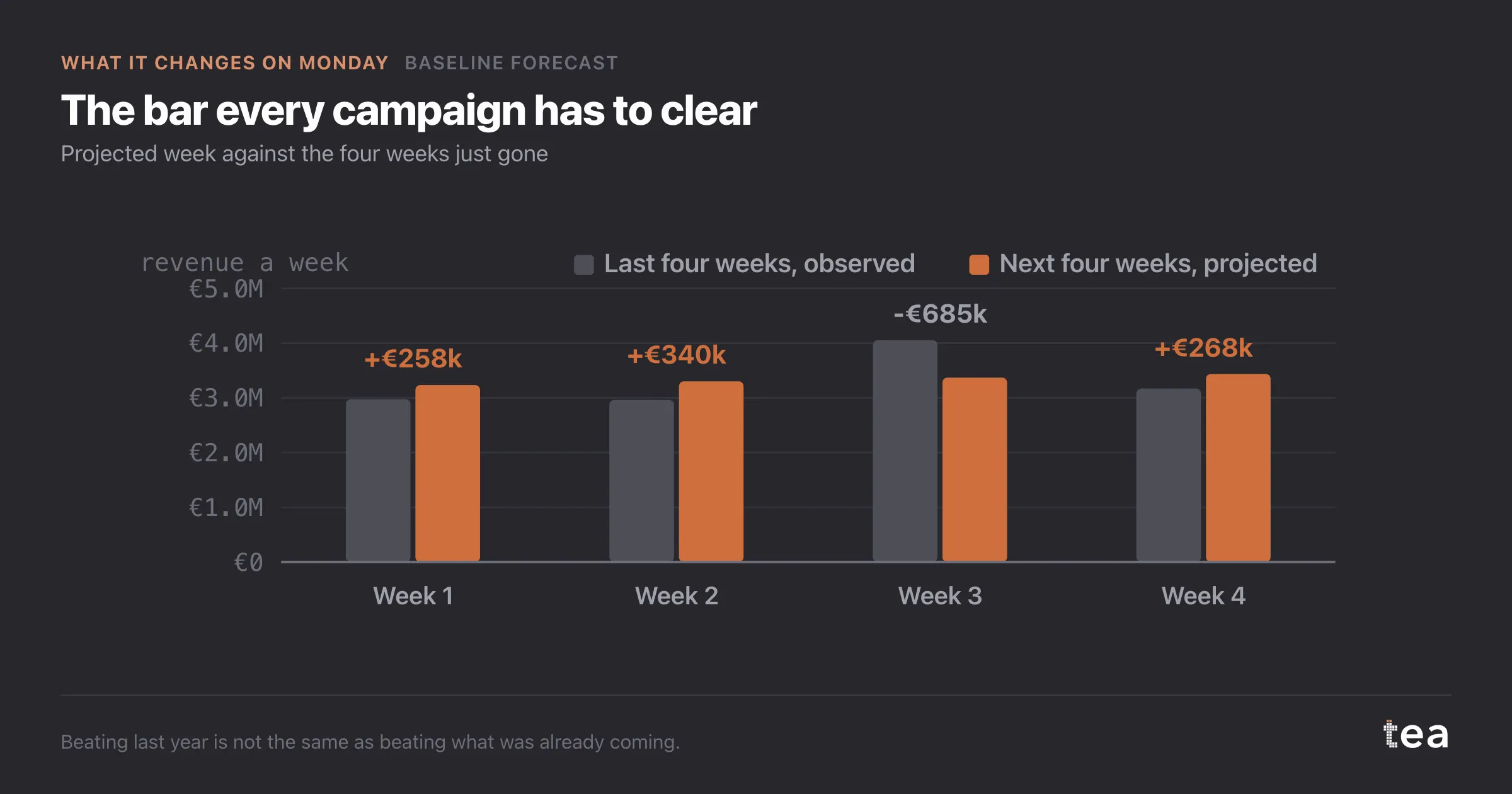
Two honest limits, printed with the result rather than left for the reader to discover.
Holt-Winters assumes the shape of the series: trend plus season plus level, nothing else. It has no drivers, no spend, no price. It cannot tell you why, only what.
And it learns the cycle it is given. Seven days here, because grocery weeks rhyme. On a business with a 52-week cycle and two years of history, the same model has seen the cycle twice, and two examples is not a pattern.
A small habit that pays for itself: look at the fitted line before you look at the forecast. Everyone scrolls to the right side of the chart, where the future is, and that is the half of the picture with no evidence in it. The left half is the part you can check, and it is the part that tells you whether the right half is worth anything.
And when the fit is poor, resist the urge to add terms until it improves. A baseline that has been tuned until it matches history perfectly has usually absorbed the very effects you were about to measure, and it will hand them back to you as business as usual.
The chart is the actual output of Baseline Forecast in TEA. The error is reported with the forecast, not behind it.
tea, the product
Your file, this question
Fifteen analyses on a CSV of weekly data, with the intervals and the diagnostics shown, and a plain sentence when the data cannot answer. Free while in beta, by invitation.
Request a place in the beta→tea, the product
Fifteen econometric analyses on your own CSV: Baseline Forecast, saturation curves, elasticities, budget allocation. Intervals and diagnostics shown, and a plain sentence when the file cannot answer.
Free while in beta, by invitation.
Request a place in the beta →Liked this? Run it on your own data.
tea runs Baseline Forecast and fourteen other analyses on any weekly CSV, in minutes. Free while in beta, by invitation.