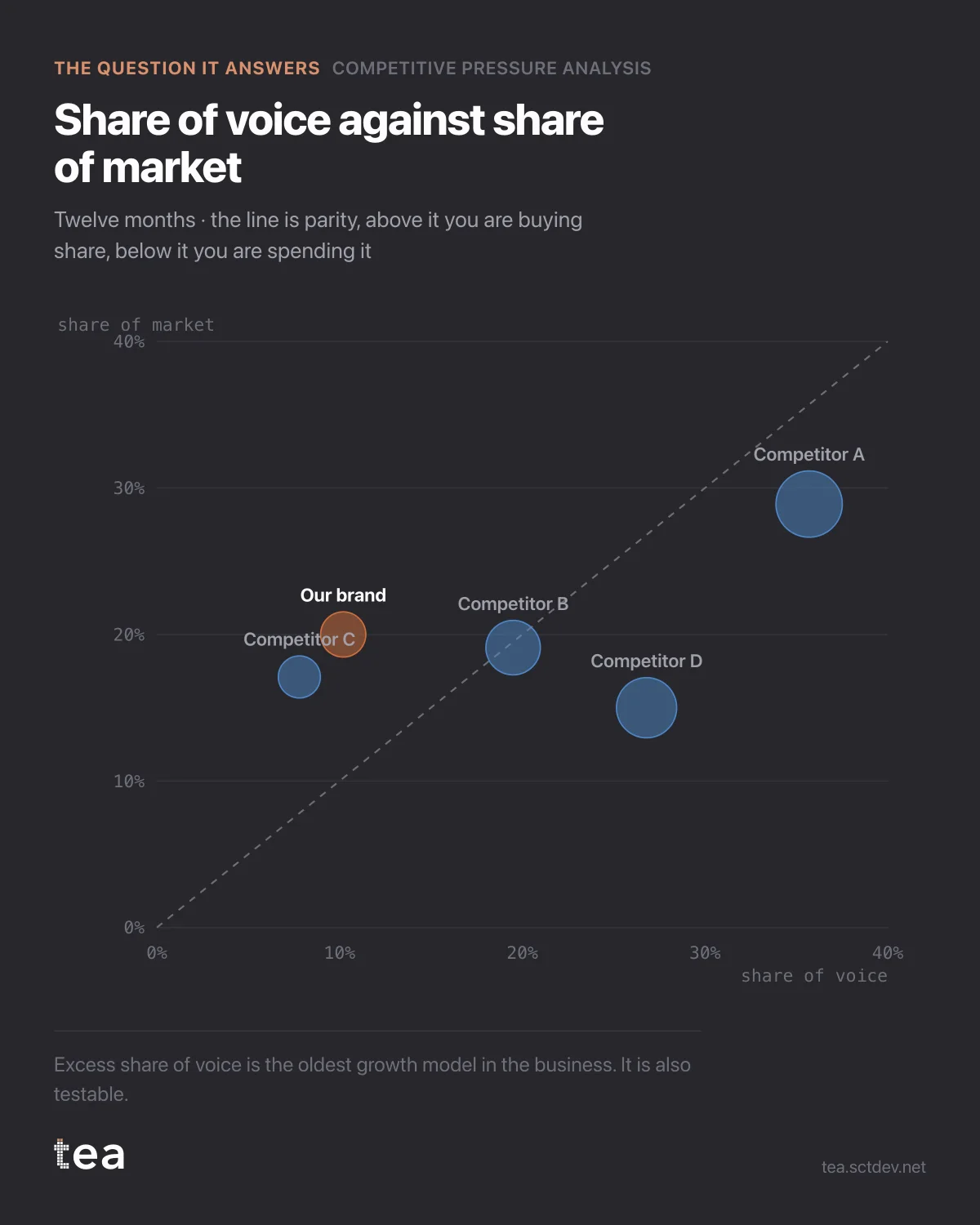
Five brands in a category. Share of voice on one axis, share of market on the other, and a diagonal where the two are equal.
Above the line you are talking more than you sell. Below it you are selling more than you talk.
Our brand sits well below: 10.2% of the category's voice against 20.0% of its market. That is an excess share of voice of -9.8 points.
Competitor D is the mirror image: 26.8% of voice on 15.0% of market, an excess of +11.8.
The old rule of thumb says excess share of voice predicts share growth. On this data the relationship is estimated rather than assumed: a slope of 0.06 share points per point of excess voice, fitted across five brands and 36 months, with an R² of 0.69 and a standard error you can read.
Applied to the brand in question, that comes out as -0.59 share points over the next year, with a 95% interval from -0.96 to -0.22. The whole interval is below zero.
Which is the uncomfortable version of a familiar situation. The brand is efficient: it converts voice into sales better than anyone in the category. It is also quietly funding its own decline, because efficiency and growth are not the same thing and the category is not standing still.
Two properties of this chart worth keeping.
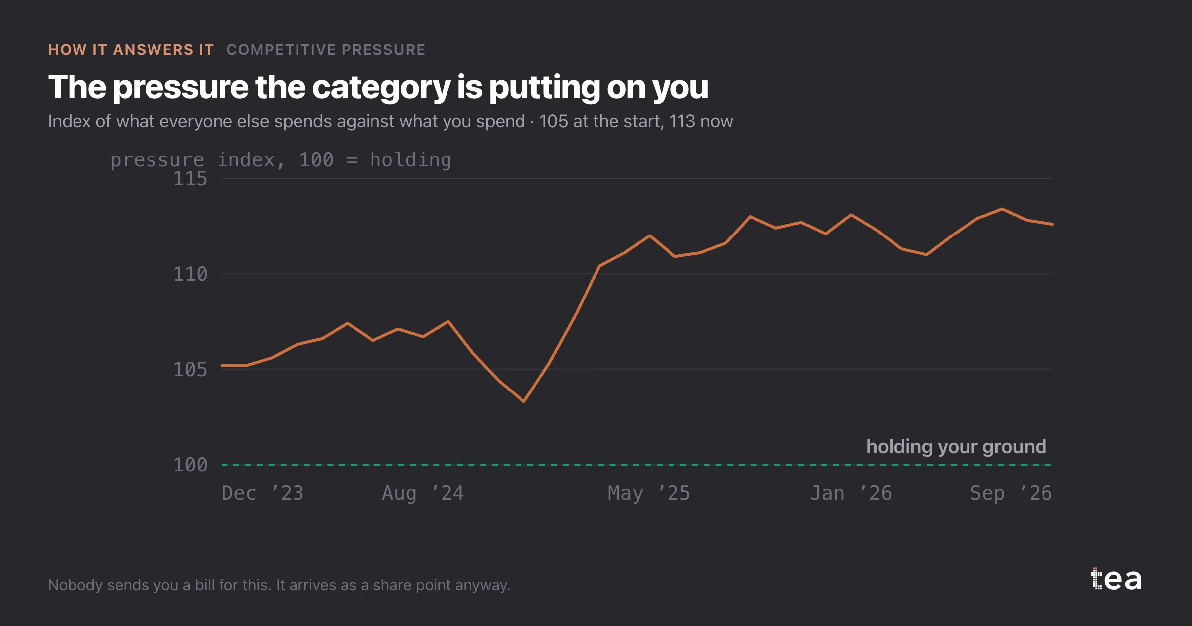
It is symmetric. Everyone's excess share of voice is measured the same way, so you can see the whole competitive set in one frame rather than your own brand against an average.
And the size of each bubble is the spend behind it. A brand can be above the line because it spends heavily, or because its market share is small, and the bubble tells you which.
What this changes in a planning cycle is the order of the questions. Efficiency metrics answer "are we spending well". This answers "are we spending enough to keep what we have", and a brand can pass the first test while failing the second for years.
Two practical notes. The input is one row per brand per month, with spend and sales value, which is the shape a competitive monitoring export already has. And the brand read as yours is a setting rather than an assumption, so the same file can be read from a competitor's side, which is a useful and slightly uncomfortable exercise.
The category here turns over €25.9M a year. Half a share point is €129,000 of annual revenue, and that is the unit to keep in mind when the media budget is being defended in a meeting about efficiency.
The chart is the actual output of Competitive Pressure Analysis in TEA, run on a sample file anyone can download.
tea, the product
Your file, this question
Fifteen analyses on a CSV of weekly data, with the intervals and the diagnostics shown, and a plain sentence when the data cannot answer. Free while in beta, by invitation.
Request a place in the beta→tea, the product
Fifteen econometric analyses on your own CSV: Competitive Pressure, saturation curves, elasticities, budget allocation. Intervals and diagnostics shown, and a plain sentence when the file cannot answer.
Free while in beta, by invitation.
Request a place in the beta →Liked this? Run it on your own data.
tea runs Competitive Pressure and fourteen other analyses on any weekly CSV, in minutes. Free while in beta, by invitation.