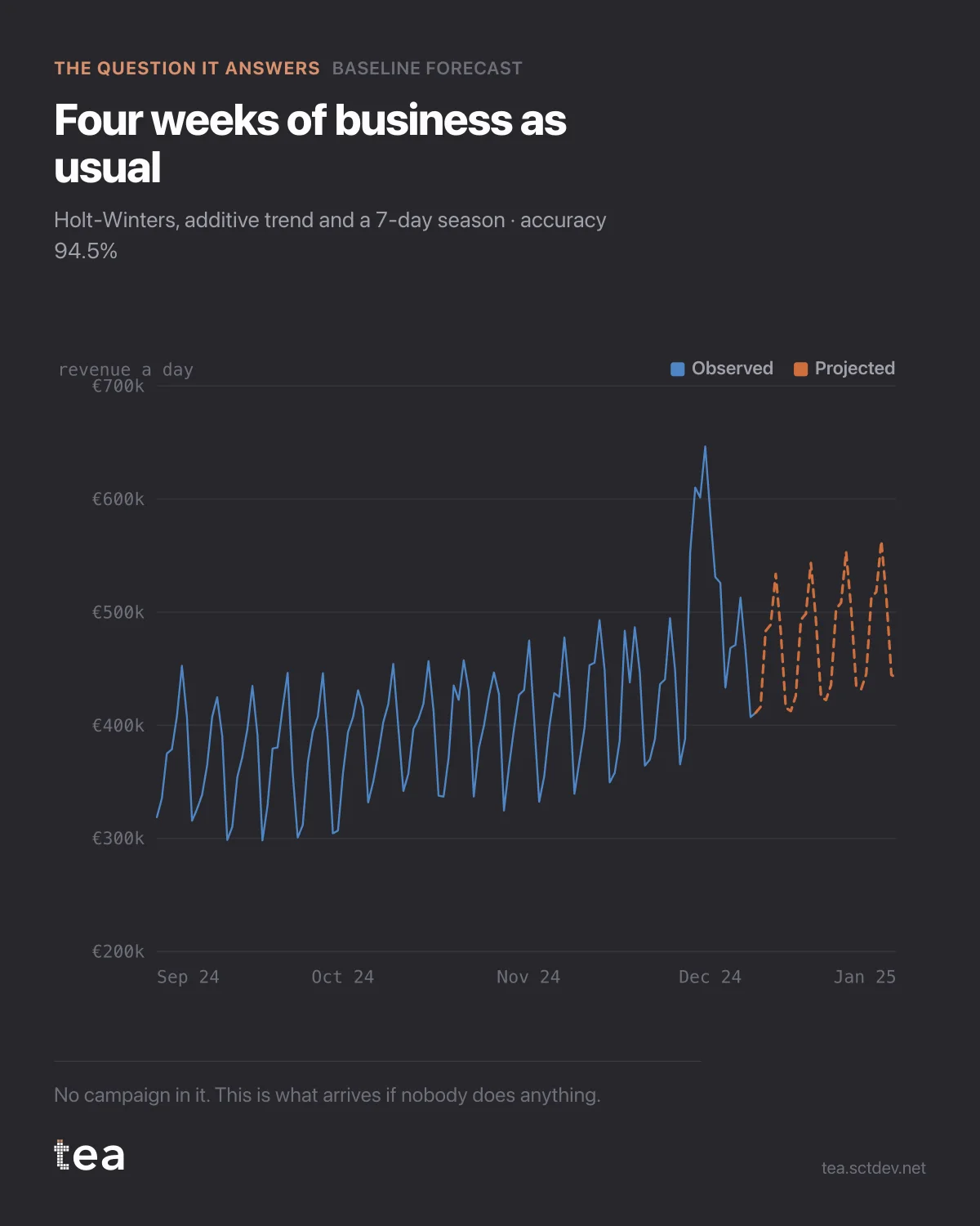
Three years of daily revenue from a grocery retailer, and four weeks projected forward with nothing in them.
No campaign. No promotion. No new store. The dashed line is what arrives if every marketing person takes the month off.
That line has a name that sounds boring and is not: business as usual. It is the only honest benchmark a campaign can be judged against, and most reporting does not have one.
Look at what the model had to learn to draw it. The series has a weekly heartbeat, because Saturday is not Tuesday in a grocery business, and it has a slow drift underneath. Holt-Winters separates the two: an additive trend, an additive seasonal term with a period of seven, and a level that updates as new days arrive. Accuracy on the history is 94.5%.
Now the part that changes meetings.
When the campaign runs and revenue rises 6%, you are not looking at a 6% result. You are looking at the difference between what happened and this line. If the line was already climbing 3% over the same weeks, the campaign bought you three points, not six, and the invoice did not get smaller.
The reverse happens more often than anyone admits. A campaign runs in a month the baseline was falling, revenue lands flat, and the plan gets called a failure. Against this line it was the best work of the quarter.
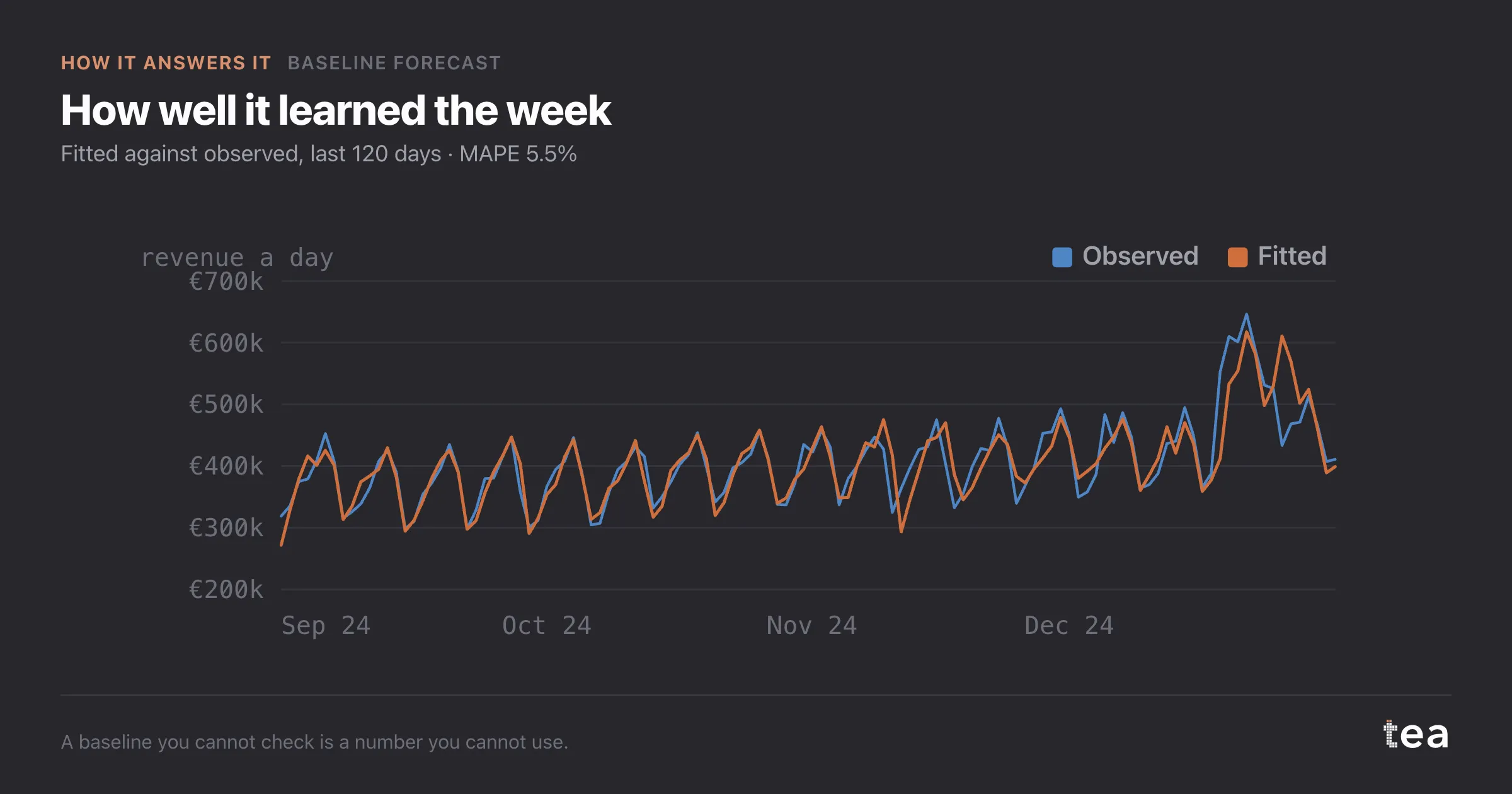
The baseline is not an academic nicety. It is the thing that decides whether your work gets counted.
One file, one date column, one number. That is the input. Weekly, daily or monthly all work, as long as the seasonal cycle is stable enough to learn.
And if the series has no stable cycle, the model will fit badly and say so, which is also an answer: a business whose weeks do not rhyme cannot be planned on a weekly benchmark.
There is a second use for this line that gets forgotten. It is a staffing and stock decision as much as a marketing one: a projection with a weekly shape tells the store how many people Saturday needs, and it is the same arithmetic either way.
The failure mode to watch for is a baseline fitted on a period that already contains heavy campaign activity. The model will happily learn your own pushes as seasonality, and from then on it benchmarks you against your best month. Fit it on the quietest stretch you have, and let the campaigns be what sits above it.
The chart is the actual output of Baseline Forecast in TEA, run on a sample file anyone can download.