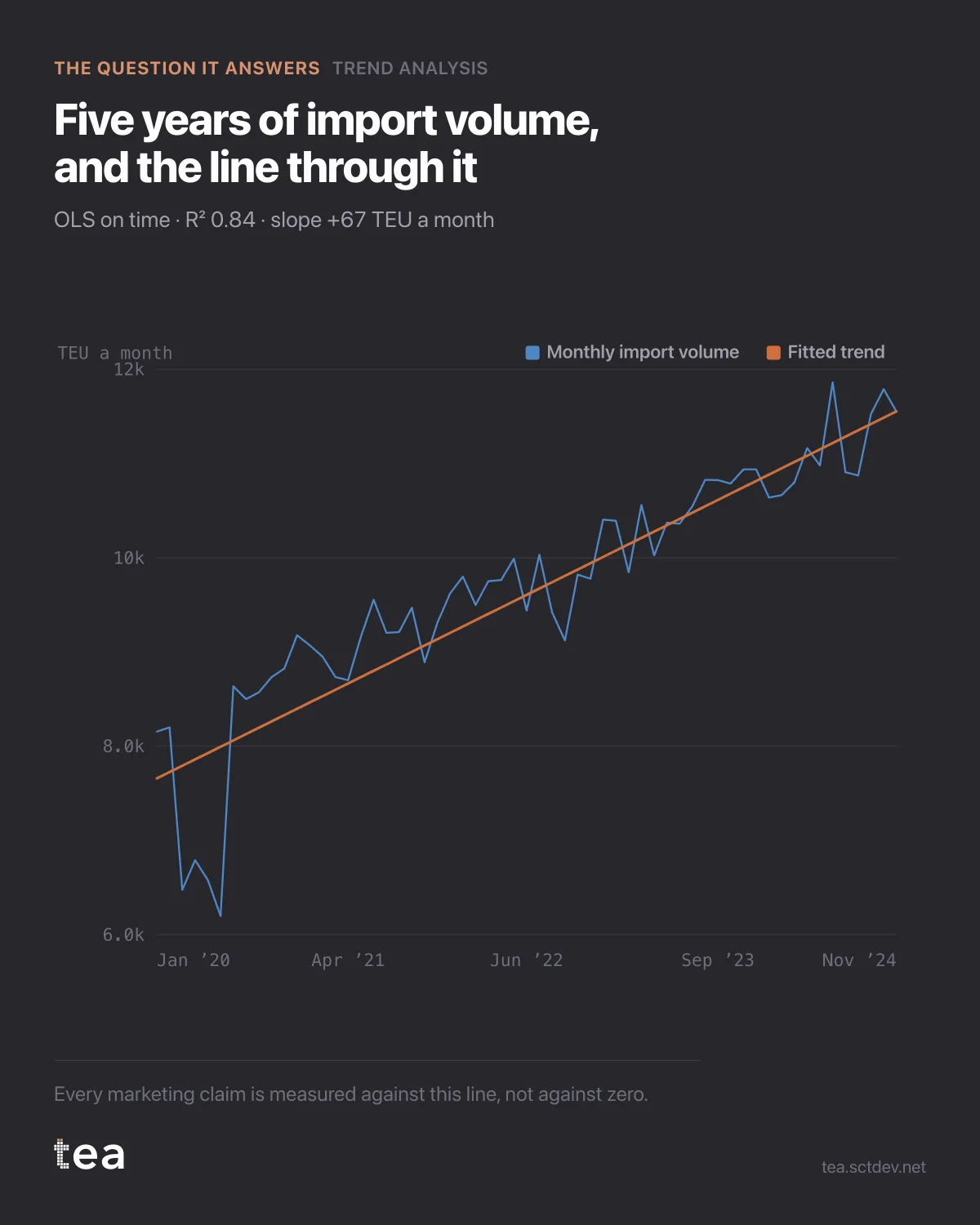
Five years of import volume at a logistics operator. The thin line is what happened. The straight one is what a regression says was always going to happen.
The slope is +67 TEU a month. Across the 59 months in the file that is the distance between 8,154 and 11,552 containers, and not one of them was bought.
Why that number matters more than it looks:
Every claim about a campaign is a comparison. Volume went up 12% after the push. Compared to what? If the honest answer is "compared to last year", you have just credited marketing with five years of structural drift.
The line is the comparison. What sits above it is what somebody did. What sits on it was already on its way.
Three things this fit says out loud, which most trend lines leave unsaid.
R² is 0.84. The line explains most of the movement, which is a polite way of saying this business is mostly its own momentum.
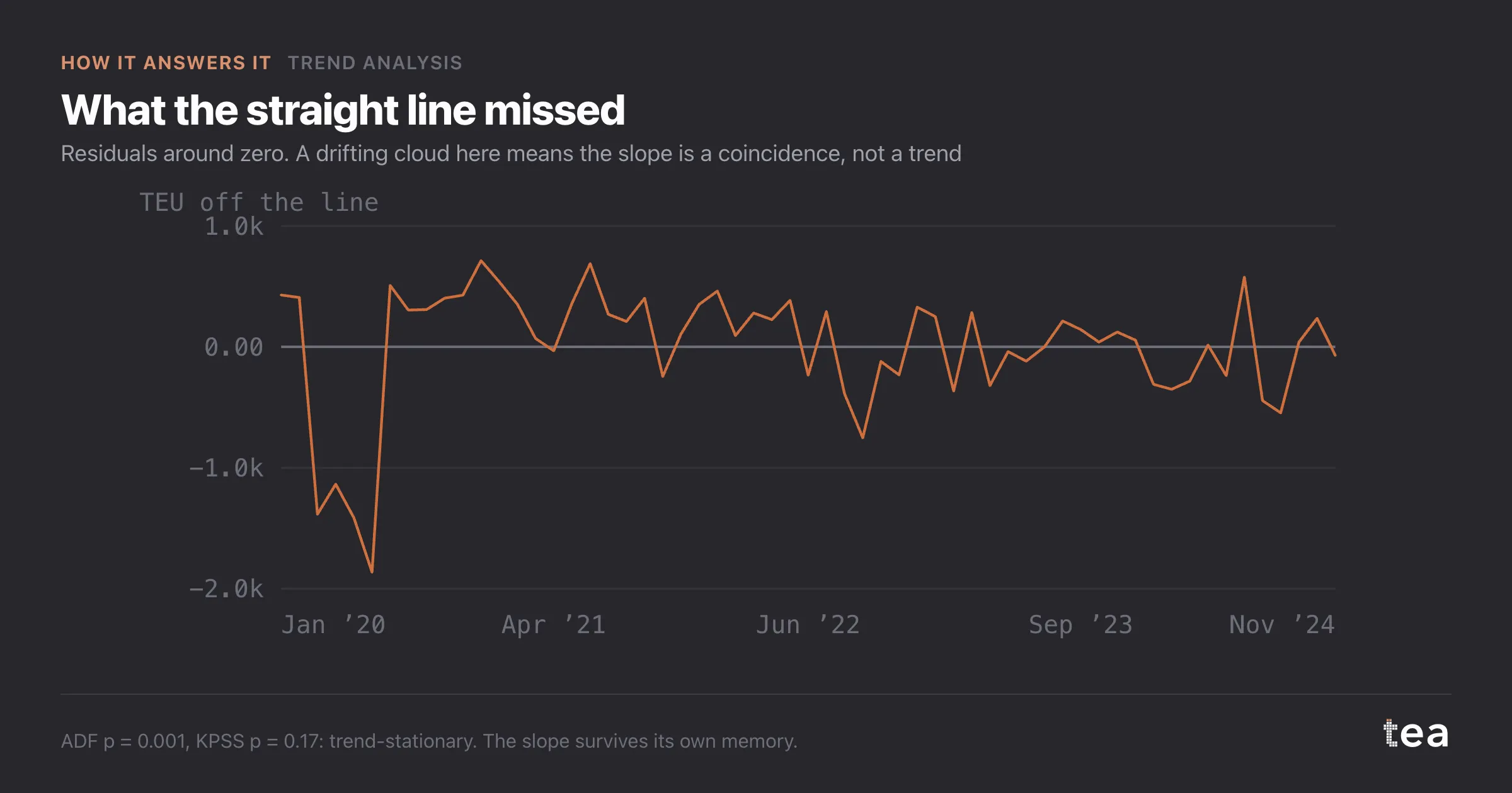
The slope carries p = 0.005, measured with a standard error that allows for residuals being correlated over time. A plain OLS p-value would have come back far smaller and far too confident, because these observations are consecutive months of one series and they are not independent draws.
And with 59 observations, a declared 5% can be worth up to 18% in practice. That sentence is printed next to the slope, not buried in an appendix, because under roughly 104 points a series that drifts and a series that wanders cannot be reliably told apart.
None of this makes the trend less useful. It makes it honest, which is what you need the moment a trend becomes the baseline of a business case.
So this is where the work starts. Before attribution, before incrementality, before anyone opens the media plan. The first question is never what worked. It is what was going to happen anyway.
What it takes to get this: one file with a date column and one number column. Fifty-nine rows was enough here. No media data, no spend, no taxonomy work, because the question at this stage has nothing to do with marketing. It is a question about the business you are about to take credit for.
And the failure mode is worth naming. A slope fitted to too few points, quoted without its interval, becomes a forecast in a deck by the third slide, and by then nobody remembers it came with a warning.
The chart is the actual output of Trend Analysis in TEA, run on a sample file anyone can download. Nothing on it is drawn by hand.