Move a quarter of the budget from Meta to Google. Same total spend. What happens?
This is the answer, and the answer is almost nothing.
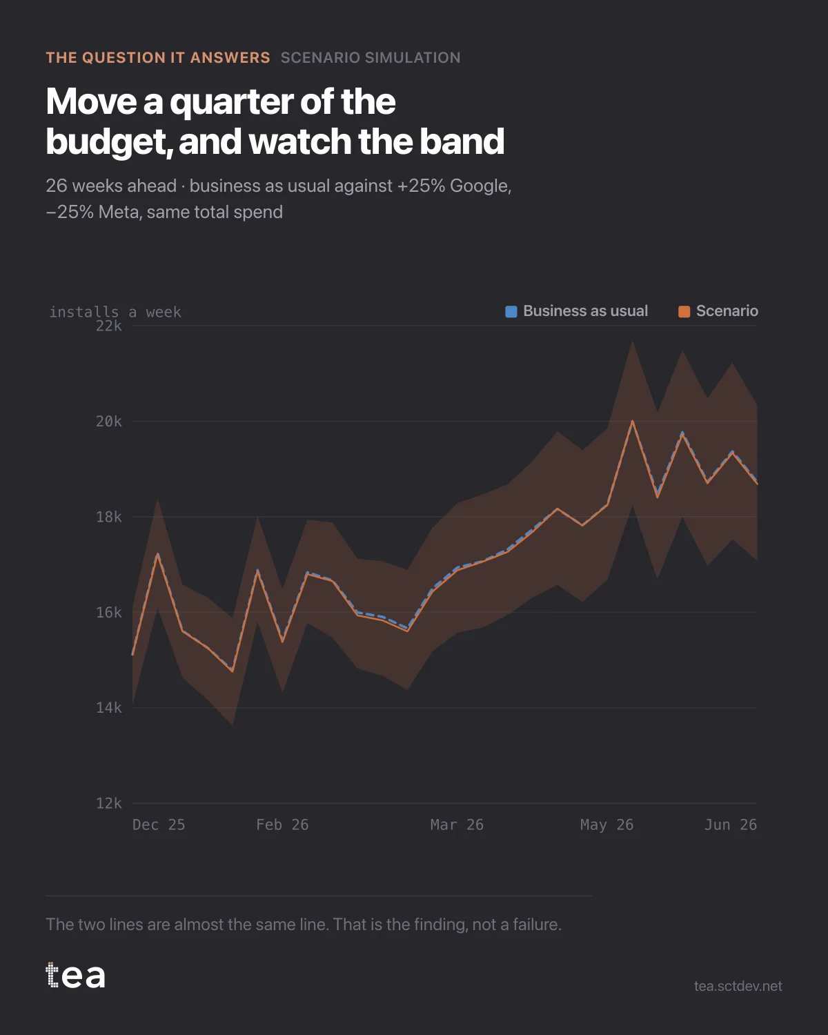
The dashed line is business as usual: last year's plan, week by week, with the trend continued. The solid line is the scenario. Twenty-six weeks ahead, they are nearly the same line, and the shaded band around them is wider than the distance between them.
The net effect is +60 installs a week, with a 90% range from -144 to +258.
A plan that needs this move to pay is a bet, and the chart says so before anyone commits.
That is an uncomfortable output and it is the most valuable one on this list, because the alternative is not a better answer. The alternative is a point estimate with no band, presented as a plan, and defended for a quarter.
Three things that make this kind of simulation trustworthy rather than theatrical.
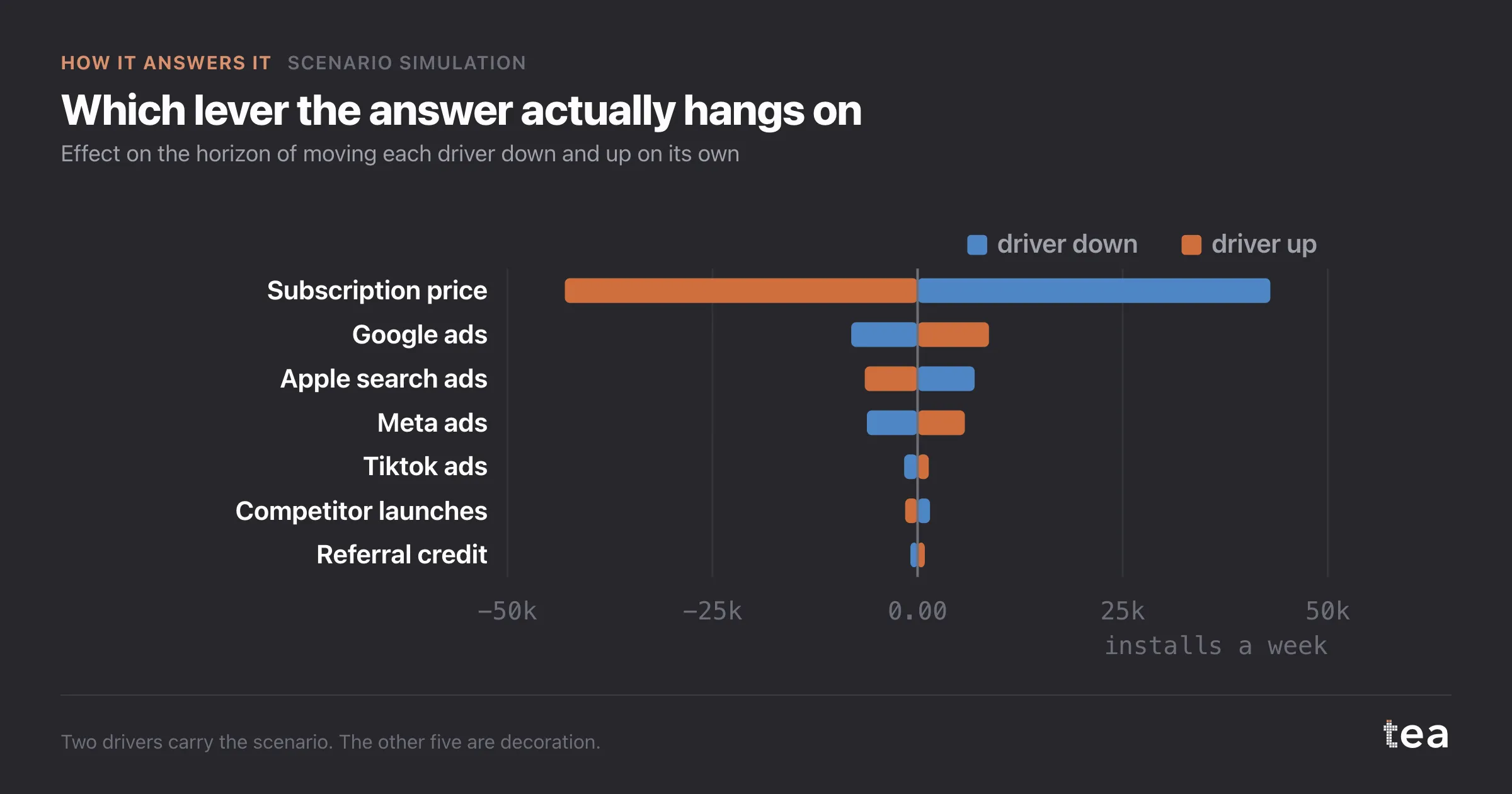
It is a fitted model, not a spreadsheet. The drivers carry adstock and saturation, estimated on the history, so moving money into a channel does not produce a linear payoff forever.
The counterfactual is explicit. Business as usual here is defined as last year's plan week by week with external controls held at last year's average, and that definition is printed with the result. Every scenario is a comparison, and a comparison with an undeclared baseline is a number without a meaning.
And the uncertainty is propagated, not bolted on. The band comes from the covariance of the estimated coefficients, which is why it widens where the drivers are weakly identified.
The fit behind it is honest too: R² 0.58, MAPE 9.4%, on 104 weeks. That is a reasonable model of a noisy install series, and it is nowhere near precise enough to detect a 60 install swing. Which is exactly what the band is telling you.
A practical note on how to ask a scenario question. Vague briefs produce vague answers: "what if we spend more on digital" has no number in it. "Plus 25% on Google, minus 25% on Meta, same total, twenty-six weeks" can be simulated, reported with an interval, and checked afterwards.
The second half of that sentence matters as much as the first. A scenario is a prediction, which means it can be wrong in public, and writing it down before the quarter starts is what turns a planning tool into a learning one.
One more thing this chart quietly settles. Because the total spend is held constant, nobody can claim the result by asking for more budget. Every simulation like this is a question about allocation, and allocation is the only lever most teams actually control.
The chart is the actual output of Scenario Simulation in TEA, run on a sample file anyone can download.