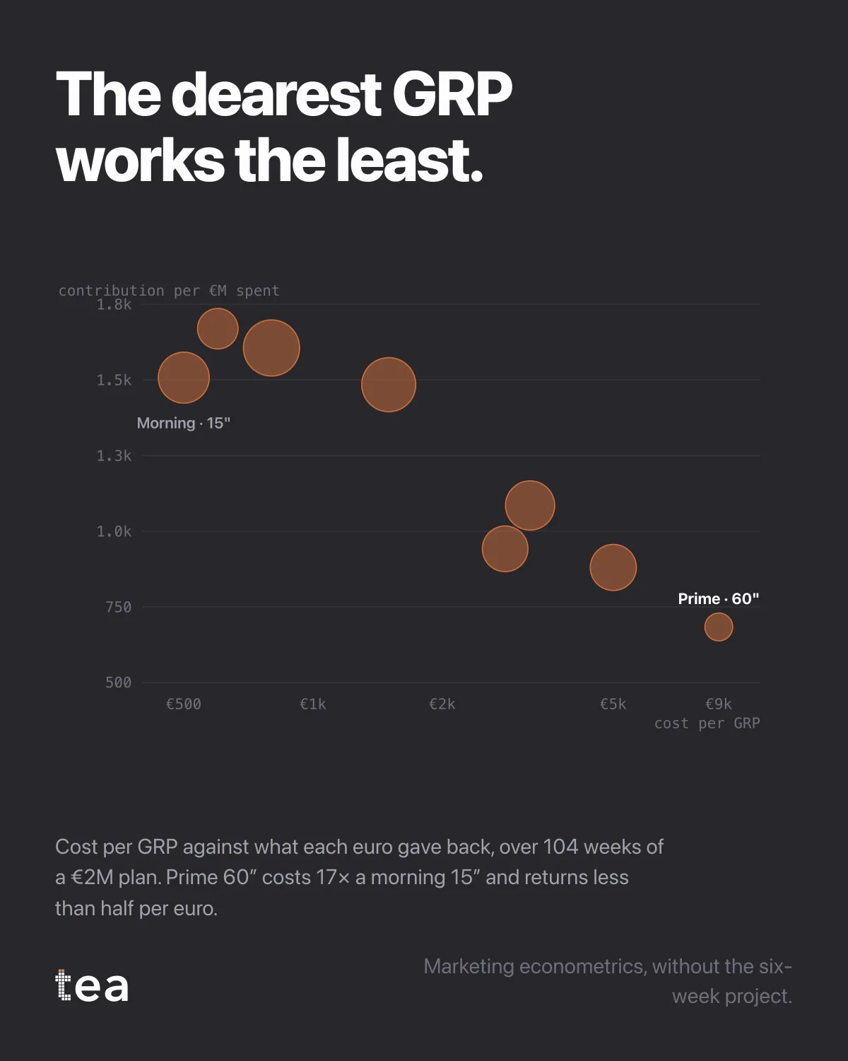
The dearest GRP works the least.
Eight TV dayparts from a €2M plan, plotted over two years. Cost per GRP on the horizontal axis, on a log scale because the prices span a factor of seventeen. What each euro gave back on the vertical. The size of each bubble is how many GRPs that slot actually buys inside the plan.
Prime 60 seconds costs 17 times a morning 15, and returns less than half per euro.
Every media director knows the direction of that relationship. What they usually do not have is the slope, on their own plan, with their own prices, for the year they are about to buy.
Three things this chart settles that a cost per point table cannot.
It is about return, not price. A cheap GRP that reaches nobody is not a bargain, and this axis is the contribution the model attributes to that daypart per euro spent, not the audience the seller delivered.
It is about the trade, not the ranking. Nobody can buy a plan made only of morning 15s, and the chart is not an argument for trying. The bubbles show what was actually bought, and the question it poses is about the mix at the margin.
And it is comparable across a negotiation. When the concessionaire moves the price of a package, the point moves along the horizontal axis, and the plan can be re-evaluated in the room rather than in a week.
The structural point underneath is about who holds the evidence. Cost per point is quoted by the people selling the inventory. Return per euro has to be estimated from your client's own outcome data, and if nobody does that estimation, the only number in the negotiation is the seller's.
That is the asymmetry this kind of analysis exists to close, and it is closable now in the time it takes to prepare the meeting rather than in the time it takes to commission a study.
A caution that belongs on the same slide as the chart. Efficiency per euro is not a plan on its own. Reach, frequency and the audience each daypart actually delivers are real constraints, and a plan built only on the vertical axis would buy a lot of cheap inventory against the wrong people.
What the chart does is make the trade explicit. When the argument is "prime is worth the premium", the premium is now a number on the horizontal axis and the worth is a number on the vertical, and the discussion is about the gap between them rather than about conviction.
The other thing worth saying is that this is not a one-off study. The prices change every season and the returns change with the creative, so the chart is only useful if it can be redrawn before each negotiation.