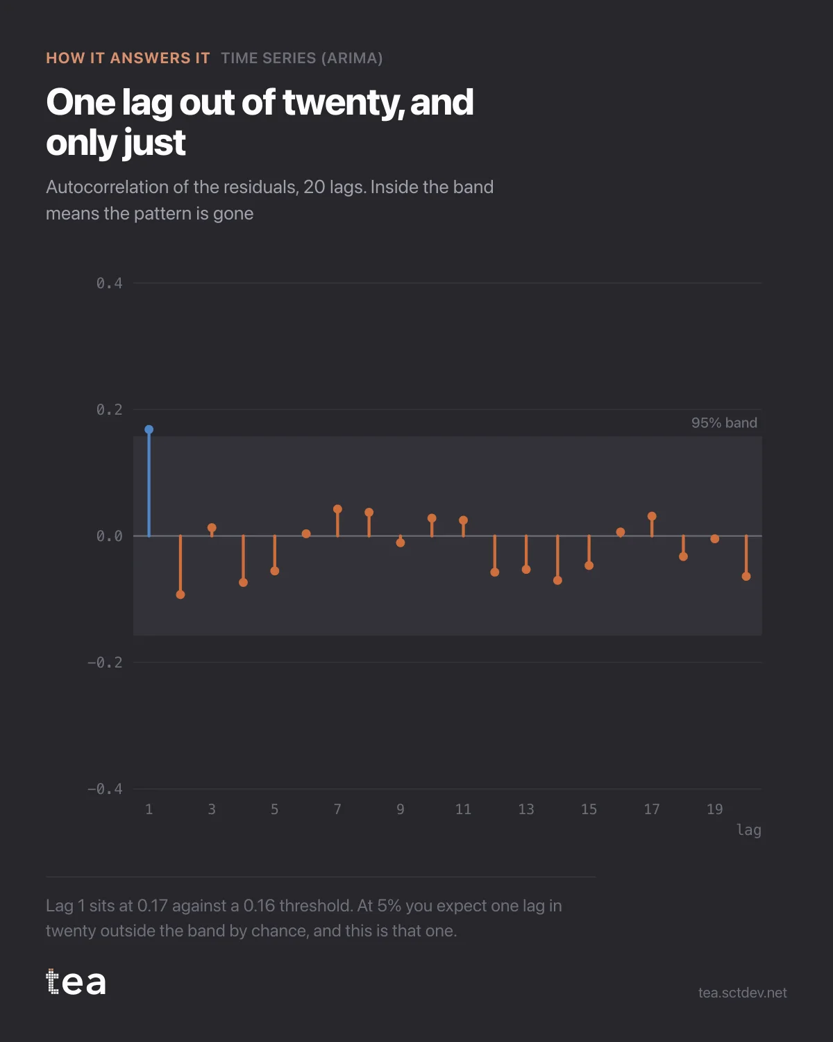
This is the chart that tells you whether a forecast is finished, and almost nobody looks at it.
It is the autocorrelation of the residuals: what the model failed to explain, checked for whether it still has a shape. Twenty lags, and a band that marks where random noise would sit.
The logic is simple. If the leftovers still carry a pattern, the model has not finished eating. A spike at lag 52 on weekly data means an annual season went untaken. A slow decay across the first lags means the momentum term is too weak. Either way there is signal on the floor, and it belongs in the forecast rather than in the error.
Here, one lag out of twenty pokes past the line. Lag 1 sits at 0.17 against a threshold of 0.16.
Now the part worth saying out loud, because it is where reporting usually gets dishonest in both directions.
At a 95% band you expect one lag in twenty outside it by chance. That is what the band means. One marginal exceedance at the first lag is not evidence of a problem, and it is also not something to hide. It is the expected cost of testing twenty things at once.
What would change the verdict is a pattern: several lags out, or a single large one at a seasonal position, or the same lag out across different specifications. None of that is here.
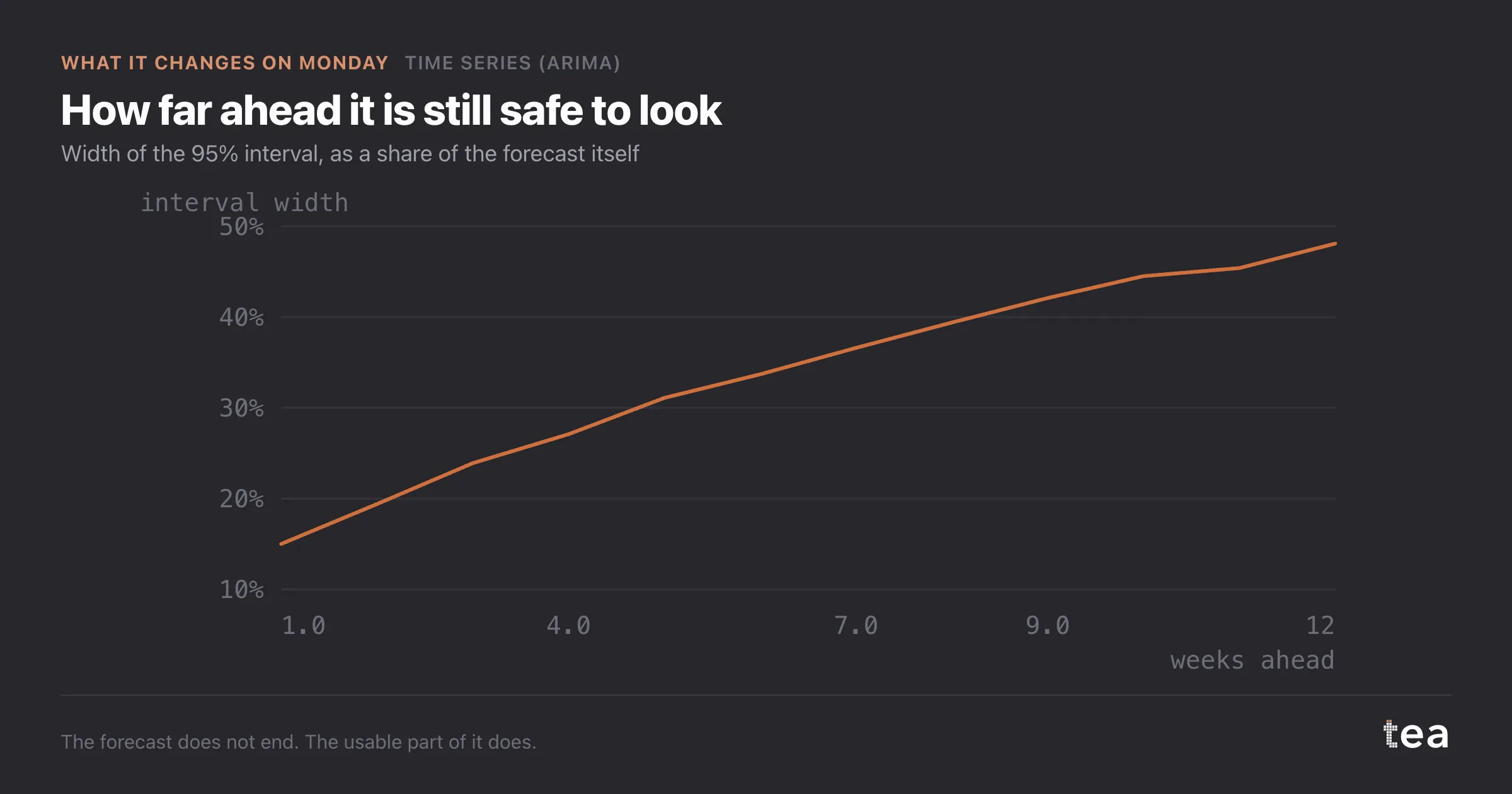
So the residuals are close enough to noise to trust the interval, and that is the whole point of running this. The confidence band on the forecast is computed as if the residuals were well behaved. If they are not, the band is too narrow, and a too narrow band is worse than no band at all, because it invites a decision that the data cannot support.
This is the part of forecasting that does not fit in a headline. A number is easy. A number you can defend takes four more charts, and this is one of them.
TEA runs the residual diagnostics with the fit and shows them next to the forecast, not on request, because a forecast without them is an opinion with a decimal point.
If you want one habit from this post, take this one. When someone hands you a forecast, ask what the residuals look like. If the answer is a shrug, the interval on that forecast is decoration, and the interval is the part you were about to make a decision with.
It is also the cheapest check in the whole workflow. The fit has already been computed, the residuals already exist, and the test is twenty numbers against a line. The reason it gets skipped is not cost, it is that nobody asks for it.
The chart is the actual output of Time Series (ARIMA) in TEA.
tea, the product
Your file, this question
Fifteen analyses on a CSV of weekly data, with the intervals and the diagnostics shown, and a plain sentence when the data cannot answer. Free while in beta, by invitation.
Request a place in the beta→tea, the product
Fifteen econometric analyses on your own CSV: Time Series (ARIMA), saturation curves, elasticities, budget allocation. Intervals and diagnostics shown, and a plain sentence when the file cannot answer.
Free while in beta, by invitation.
Request a place in the beta →Liked this? Run it on your own data.
tea runs Time Series (ARIMA) and fourteen other analyses on any weekly CSV, in minutes. Free while in beta, by invitation.