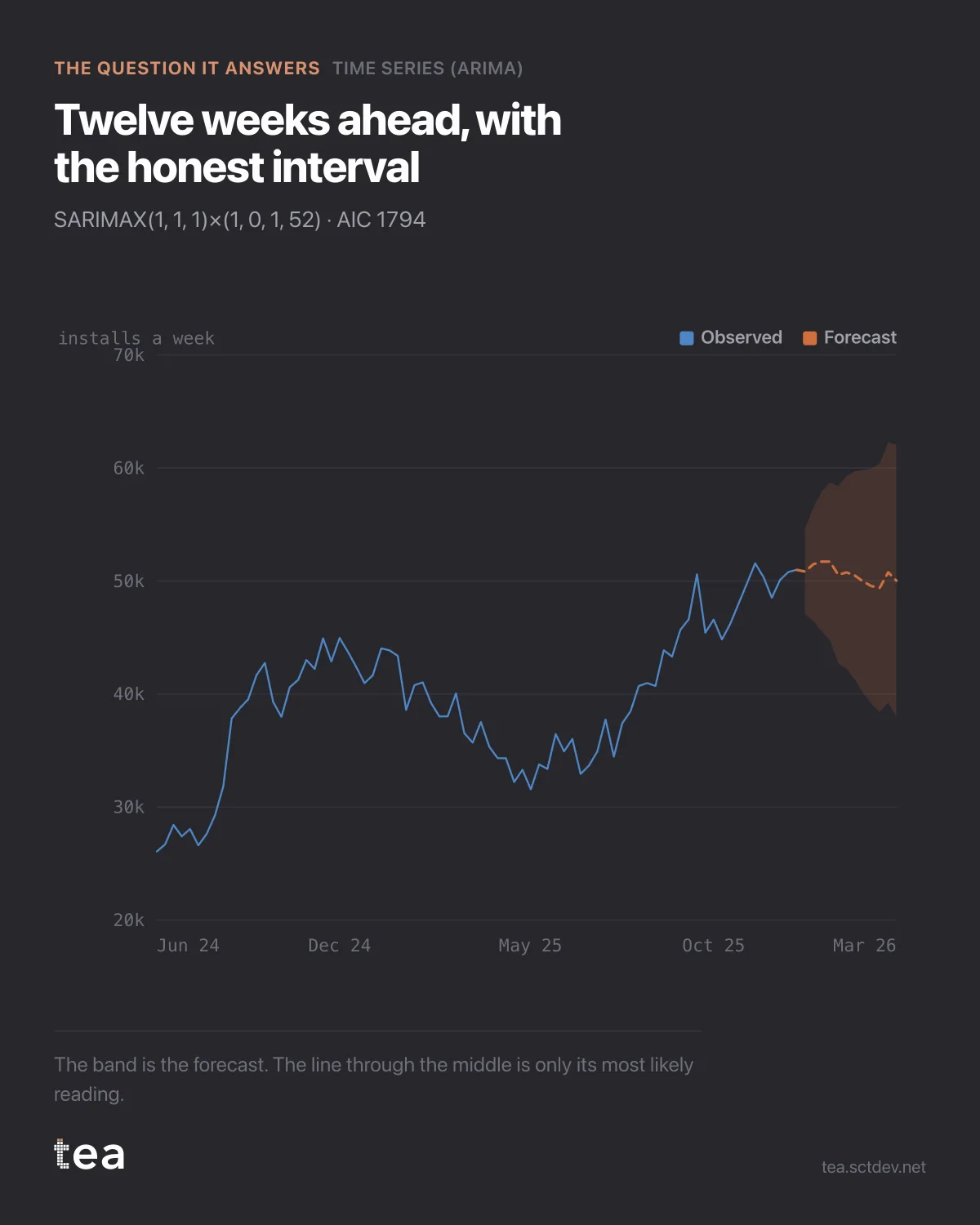
Three years of weekly installs, and twelve weeks of forecast. The part most people ignore is the shaded area.
That band is the forecast. The line through the middle is only its most likely reading, and if you quote the line without the band you have turned a range into a promise.
The model is SARIMAX(1,1,1)(1,0,1,52). In words: the series is differenced once because the level moves, one autoregressive term because this week remembers last week, one moving average term because shocks decay rather than vanish, and a seasonal pair at 52 because the year repeats.
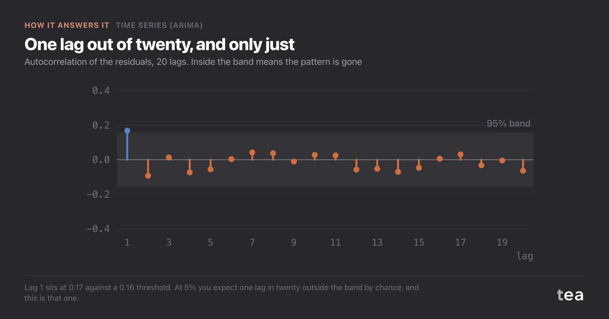
What that buys you over a straight line is memory. A trend fit treats every week as an independent draw around a line. ARIMA reads the fact that a good week tends to follow a good week, which is true of almost every commercial series and is exactly the thing that makes naive forecasts overconfident.
Three practical notes from this run.
AIC is 1794, and it is only useful in comparison. It is the score that decides between candidate orders, not a quality certificate, and the number on its own means nothing to anyone.
The seasonal term at 52 has seen the year three times in this file. Three examples of a yearly cycle is thin, and it is why the band widens the way it does rather than staying flat.
And the first forecast week sits at 50,828 installs. Twelve weeks out it is 50,018. The model is telling you this business is flat, which is a result, not a missing insight.
Where this earns its place is in planning conversations that involve a promise. Anyone can extrapolate. The value of the model is that it puts a width on the answer, and the width is what tells you whether to commit.
If the band is wider than the decision you are about to make, the honest move is to make a smaller decision.
A word on why this beats the spreadsheet version. The usual alternative is a moving average or a year-on-year index, and both are fine descriptions of the past. Neither produces an interval, which means neither can tell you when to stop trusting it, and that is the only thing a forecast is really for.
The input is the same as the simpler analyses: a date column and one number, weekly or monthly. What changes is what the model is allowed to notice. If your series has a real annual cycle and enough history to show it more than twice, this is the one to run.
The chart is the actual output of Time Series (ARIMA) in TEA, run on a sample file anyone can download.