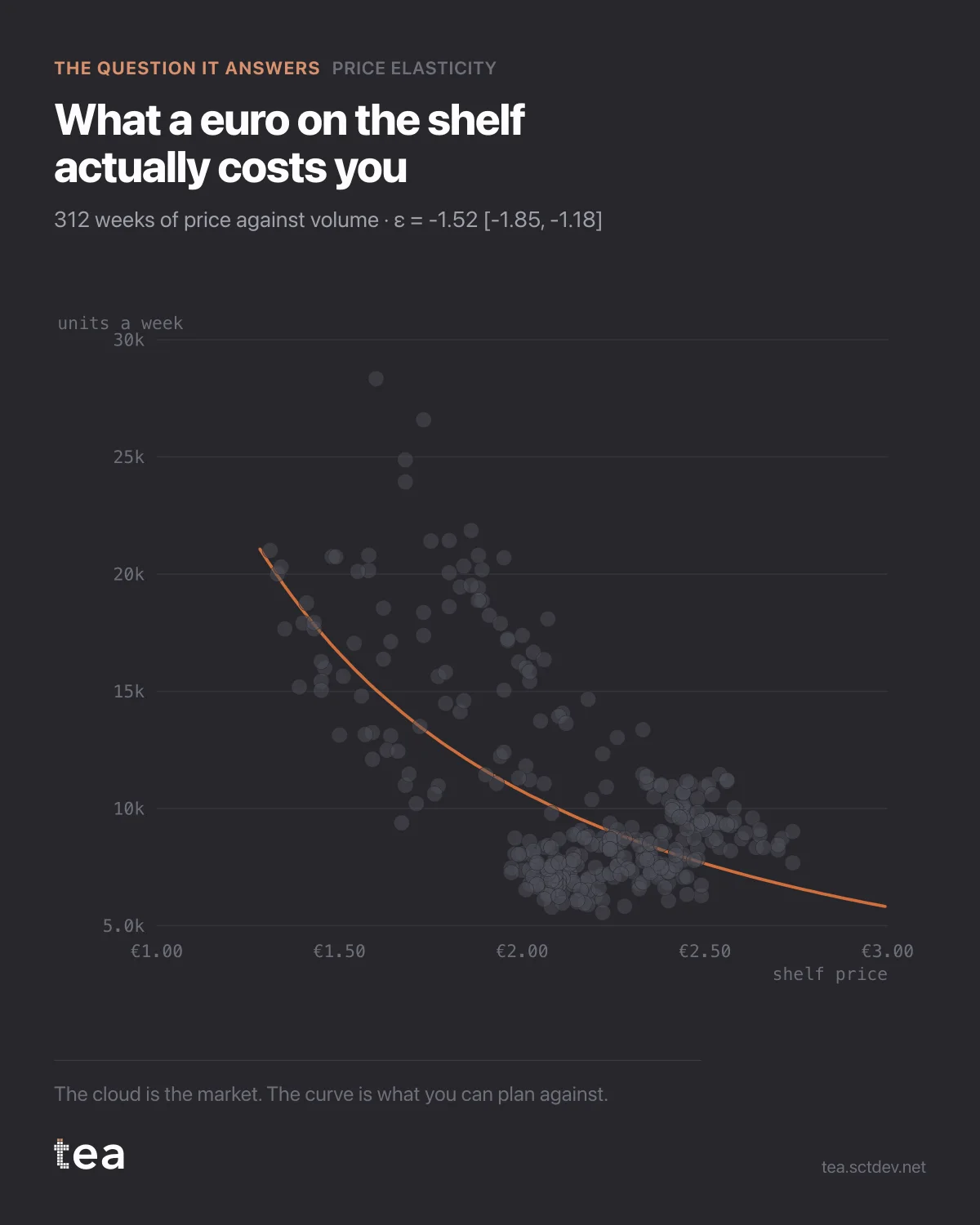
Six years of price against volume for a grocery product. Every grey dot is a week. The line is what the model thinks the relationship is.
The elasticity is -1.52, with a 95% interval from -1.85 to -1.18.
In plain terms: a 1% price increase costs about 1.5% of volume. Since the loss in units is larger than the gain per unit, revenue falls when the price goes up, and rises when it comes down. That is what elastic means, and it is a statement a category manager can act on this week.
What makes this credible rather than a correlation is what else is in the model. Promotional depth is controlled for, because a week with a deep promotion has both a low price and a display, and crediting the price alone would overstate it. The competitor's price is in there too, at a cross-elasticity of 2.84, which is larger than the own-price effect and says this is a category where the shelf next to you matters more than your own label.
Leave both out and the elasticity absorbs them. That is the standard way a price study ends up with a number that cannot be reproduced next quarter.
Two honest limits, printed with the result.
The fit is on observed variation, so it describes the range the business has actually priced in. This one covers roughly €1.28 to €3.00. An elasticity extrapolated far outside that range is an opinion in decimal form.
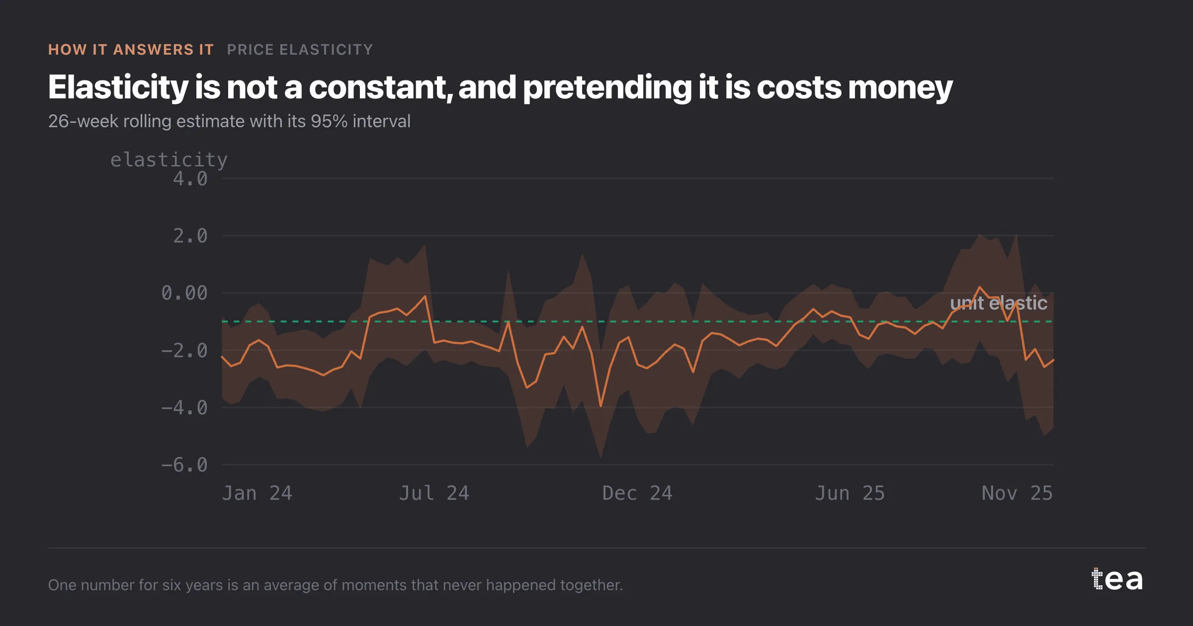
And the dots are a market, not an experiment. Prices moved for reasons, some of which are correlated with demand, and no amount of control columns turns observational data into a test. What it gives you is the best available estimate with a stated interval, which is usually the only thing on the table.
Elasticity is one of the few marketing numbers that translates directly into money on Monday morning. It deserves an interval and a controlled specification rather than a slide.
A note on the data this needs, because it is less than people assume. One row per period, a price, a quantity, and ideally a promotion column and a competitor price. That is a file most category teams already produce weekly for other reasons.
What it does not need is a test, a panel or a survey. Those are better instruments when you can have them. This is the one you can run on Tuesday with what is already on the shared drive, and having an interval on it is what stops it from being a guess.
The last thing worth saying is about the R². At 0.90 the model explains almost all the weekly movement, and that is partly because price, promotion and competitor price together really do drive this category. A high R² is not proof the elasticity is right, but a low one would be a reason to stop and look at what is missing.
The chart is the actual output of Price Elasticity in TEA, run on a sample file anyone can download.