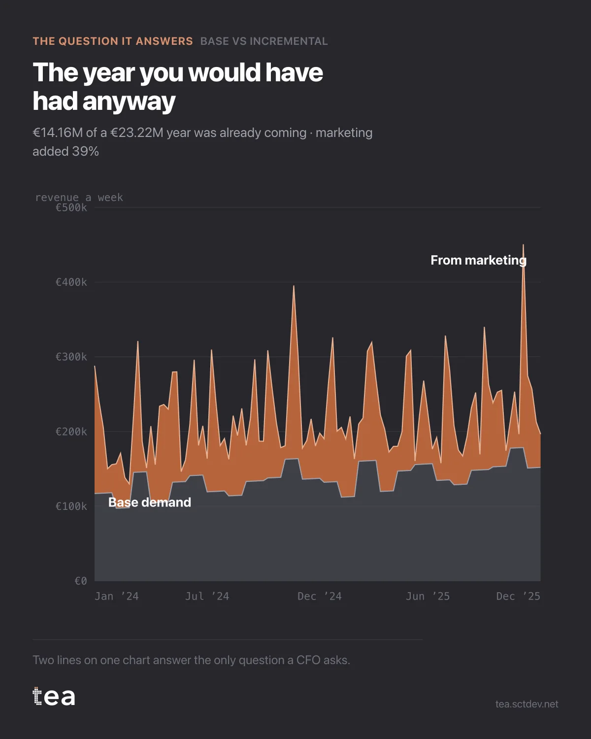
Two years of revenue at a merchandising business, split into two bands.
The lower one is what the business would have done with the media budget at zero. The upper one is what the campaigns added.
€14.16M of a €23.22M business was already coming. Marketing added €9.06M, which is 39% of the year.
That single sentence is the one most companies cannot say about themselves, and it is the sentence every other marketing number depends on.
Notice what it does to the usual claims. Revenue up 15% year on year is not a marketing result: on this business the base alone grew 30% over the two years. A channel that reports a 4x return is reporting against a denominator that includes whatever the base was doing that week. Until the two bands are separated, every efficiency metric is measuring a mixture.
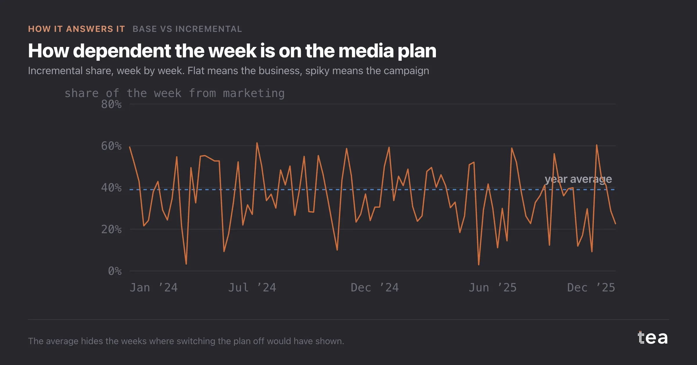
And the split is not a constant. The weekly incremental share runs from 2.9% in the quietest week to 61.4% in the loudest. Same business, same channels, same year. Averaging that to 39% is useful for the board and dangerous for planning, because the weeks are not interchangeable.
How the separation is made, briefly. The model fits the KPI against the media drivers plus the structural terms, then re-evaluates it with the media set to zero. What remains is the base. What disappears is the incremental. Because it comes from a fitted model rather than from a holdout, it is an estimate with error, and it is only as good as the drivers included in it.
The reason to run it anyway is that the alternative is not a better method, it is an assumption. Most organisations assume the base is last year, or flat, or whatever makes the campaign look reasonable. This makes the assumption explicit and puts a number on it that can be challenged.
The best use of this chart is with finance in the room. It is the view where an ROI conversation stops being a negotiation between two dashboards and becomes an argument about one number.
39% is the answer here. The number matters less than the fact that somebody has one.
There is a version of this chart for every business, and the shape of the two bands is itself a diagnosis. A thick base with a thin fringe on top is a business with strong structural demand and marketing at the margin. A thin base with tall spikes is a business that is bought week by week, and it will feel very different to run.
Neither shape is wrong. What is wrong is not knowing which one you are in, because the two demand opposite budget behaviour: one rewards consistency, the other rewards timing.
The chart is the actual output of Base vs Incremental in TEA, run on a sample file anyone can download.