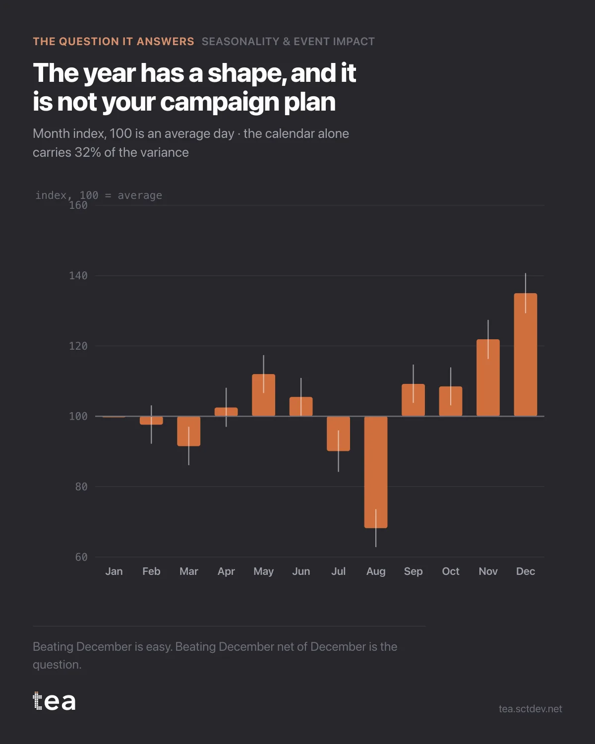
Three years of daily retail revenue, reduced to twelve bars. December sits at 135. August sits at 68.
That is a factor of two between the best month and the worst, and not one point of it was decided by a marketing team.
Here is the number that should be on the wall of every planning room: on this series the calendar alone accounts for 32% of the variance, and dated events for another 44%. The structural trend accounts for 1.6%. Three quarters of what happens is when it happens.
The consequence is uncomfortable and useful. A campaign that runs in December will look brilliant. The same campaign in August will look broken. Neither result is about the campaign, and any reporting that does not remove the month first is measuring the calendar with a marketing budget.
What the model does is straightforward. It fits month effects, weekday effects and a trend together, so each one is estimated net of the others. The December bar is not "December revenue". It is what December does after the weekday mix, the trend and the events have been accounted for. That distinction is the whole value.
Three ways this changes a plan.
Timing beats weight. Moving spend two weeks, into the shoulder of a peak rather than the middle of a trough, is usually worth more than a 10% budget increase, and it costs nothing.
Targets stop being annual. A monthly target built from an annual average and divided by twelve is wrong in both directions for ten months of the year, and everyone hits or misses for reasons nobody controls.
And the flat months become the interesting ones. If August is structurally 68, the question is not how to make August look like December, it is what a reasonable August looks like and what it takes to beat it.
This is the first chart to run when you inherit a business you do not know yet. It tells you what the year does on its own, which is the context every other number lives inside.
What it needs from you is modest: a date column, one number, and optionally a few columns of ones and zeros marking the days something ran. Three years is comfortable here because each month has been seen three times. With one year, every month effect rests on a single example, and the intervals will say so.
There is also a warning in this chart for anyone who inherits a forecast. If the calendar carries three quarters of the movement, a model that omits it will hand that variance to whatever else is in the file, usually media spend, because spend tends to follow the season. That is not attribution. That is the calendar wearing a media label.
The chart is the actual output of Seasonality & Event Impact in TEA, run on a sample file anyone can download.