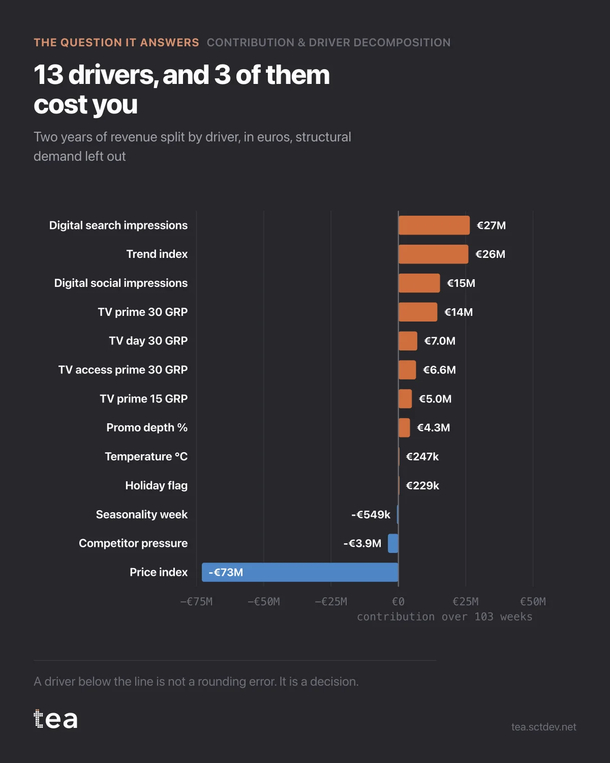
Two years of grocery revenue, split by what moved it. Thirteen drivers, in euros, with structural demand left out so the rest is readable.
Three of the thirteen sit below the line. That is the part of this chart most reporting does not have, because most reporting only counts the things that helped.
Digital search contributed €26.5M. The structural trend, which nobody bought, contributed €26.0M. Digital social €15.5M. Then the TV dayparts, then promotion.
And price took €73.0M out.
That single bar is longer than every media bar put together, and it is the reason this analysis exists. A year in which media added €75.1M and price removed €73.0M is a year that looks flat in the P&L and is anything but flat underneath. If you report only the media contribution, you have described a third of what happened, and the reader will draw conclusions about marketing from a number that was decided in a pricing meeting.
Three properties of this decomposition that a channel report cannot give you.
The drivers are estimated together, so each one is net of the others. TV does not get credit for the week it ran alongside a promotion, and the promotion does not get credit for the season it ran in.
Negative contributions are allowed to be negative. Price, competitor pressure and the seasonal term all take here, and forcing them to zero would silently move their effect onto whatever is left.
And the split is in outcome units, not index points. Euros go into a business case. Coefficients go into an appendix.
What this does to the conversation is the interesting part. A marketing team that can say "we added €75.1M and the price moves took €73.0M" is in a completely different meeting from one that can say "our channels were up 12%". The first is a statement about the business. The second is a statement about the dashboard.
Structural demand, the €346.6M that was coming regardless, is deliberately excluded from this view. It is thirty times larger than the biggest lever and it would flatten every other bar into a line.
A note on what the file needs to look like. One row per period, one column per driver, and enough weeks that the drivers do not all move together. 103 weeks here, thirteen drivers, and the drivers were flighted differently from each other, which is the condition that lets a model separate them at all.
The failure case is a plan where everything runs at once, always. Then TV, search and promotion are the same column wearing three names, and no method will split them. If that is your file, the honest output is a warning rather than a chart, and it should arrive before the presentation.
The chart is the actual output of Contribution & Driver Decomposition in TEA, run on a sample file anyone can download.