ea

Analyses/Discovery Path/Base vs Incremental

The year you would have had anyway.

Base vs Incremental asks a fitted model what the KPI would have been with every media column at zero, week by week, and calls what is left the base. The gap between that year and the real one is what marketing added.

Answers How much of the year did marketing add? Needs Weekly KPI, spend per channel, a date column Hands back Base and incremental, week by week, and dependency

A year of revenue, and the part marketing added

weekly revenue, 2025
  • Base, media set to zero
  • From marketing
Base€29.4Mof €38.0M, with no marketing at all
From marketing22.6%€8.6M on €3.1M of spend
Fourth quarter30%from marketing, against 17% in Q3

The Nordic apparel retailer of the first example below. A composite case: your file draws its own base, with the fit it comes from beside it.

01

What it is for

Every efficiency number in marketing is a ratio, and every ratio has the whole KPI underneath it until somebody separates the two. The base is the part of the year no campaign can claim, and the incremental band is the part a cut would put at risk.

Answering the board’s question

“What would we have sold without marketing?” is a fair question with a real answer, as long as the file has seen weeks close to nothing. The split puts both halves in euros, so the argument is about one number.

Sizing a cut before it is made

Three quarters of a year can be base and the last quarter can still be where marketing does its work. Where the band is thin, a cut costs least. Where it is thick, it costs the most.

Setting up every return that follows

A channel’s return is measured against the incremental half, not against sales. Once the base is out, the next questions are which drivers made the rest and where the next euro should go.

02

How to read it

The results open with a sentence, five cards and the year drawn in two bands. The cards are the summary, the chart is the evidence: read them in this order, then look at the weeks.

€8.6M came from marketing
Baseline share 77%1 Incremental share 23%2 Dependency Moderate3 Baseline trend +41.7%4 Peak lift €487k5

Actual vs Baseline

  1. Baseline share. What the model keeps when every media column is set to zero, as a share of the KPI. It is a counterfactual, not an observation: nobody switched the plan off to see it.
  2. Incremental share. The rest, and the number in the headline above the cards. It is an average over the year: the same split runs from almost nothing in a quiet week to most of a loud one, so read the chart before quoting it.
  3. Dependency. The incremental share put into a band: Low under 20%, Moderate to 35%, High to 60%, Very high above. It measures how much of the KPI needed a campaign, not whether the campaigns were good.
  4. Baseline trend. The last week of the base against the first. The base keeps the calendar month, so on a seasonal business this number carries the season with the growth: a quiet January against a busy December. For structural growth, read the dashed line in Baseline trend over time.
  5. Peak lift. The largest single week of incremental revenue, and which week it was. It names one week to reconstruct before the next plan: what was running, and at what weight.

03

Where it sits in the analysis

Base vs Incremental closes the Discovery Path. It comes last because it is a summary, and a summary is only safe once its parts have been looked at: the slope first, the calendar second, every driver with its share third. Read on its own, it hands the board one number with nothing underneath it.

It carries nothing further down the path, because the path ends here. What it hands on is a question, and the result suggests where to take it: Contribution Decomposition to open the incremental half, Budget Optimization to move the money behind it, and Lag & Carryover to see how much of the base is last quarter’s media still landing.

The split is fitted on its own: a trend, the calendar month and the media columns, in one regression. The decomposition before it can carry price, promotions and controls as well, which is why the two are worth reading side by side.

Discovery Path

  1. Trend Analysis

    Reads the structural slope first, with its confidence band, so nothing that follows gets credit for it.

  2. Seasonality & Event Impact

    Separates the calendar from the campaigns. Christmas is not a media result.

  3. Contribution & Driver Decomposition

    Gives every driver its share of the KPI: media, promo, price, controls, week by week.

  4. Base vs Incremental this page

    Collapses the drivers into the split a CMO actually asks for, with the counterfactual year underneath.

04

Where it usually misleads

The split is one subtraction. Everything that can go wrong is in what the model was allowed to see, and a percentage looks the same whether the file earned it or not.

A zero the file never visited

The base is the model asked about a week with no media. If the quietest week in the file still carried €40k, that week is an extrapolation from €40k to €70k, and a base anywhere between a fifth and three quarters of sales can fit. Second example below.

Before quoting the base, find the lowest week of total spend in your file. If it is far from zero, plan one: holdout regions or a few deliberate low weeks, then run it again.

Last quarter’s media counted as base

The split reads spend in the week it was booked. A burst that keeps working for six weeks leaves its tail in the weeks after, and the model files that tail under base. Channels with a long memory look smaller than they are, and the base looks stronger.

After the run, tea suggests Lag & Carryover as a next step for exactly this reason: part of the baseline may be last quarter’s media still landing.

What the model never saw ends up in the base

The regression behind the split holds a trend, the calendar month and the media columns. New listings, a price cut, a competitor leaving the shelf: whatever is not in it is absorbed, usually into the base. A base that grows with the store count is not brand equity.

Run Contribution Decomposition on the same file with price, promotions and controls tagged, and read the two splits side by side.

An average return used as a marginal one

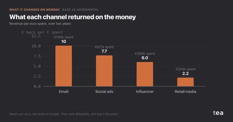
Incremental ROI is all the incremental revenue divided by all the spend: what the year’s marketing returned on average. It says nothing about the last €100k in a channel, which may already sit on the flat of its curve. Cutting where the average is lowest is not cutting where the next euro is worth least.

Take the channels you plan to cut to Saturation Curves first: the marginal return is read there, not here.

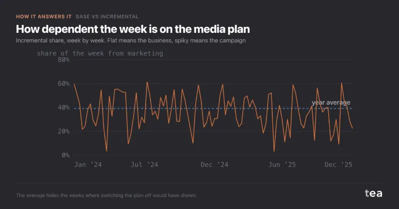
One share for fifty-two different weeks

An annual 39% can hide a range from 2.9% in the quietest week to 61.4% in the loudest. A cut planned on the average lands on particular weeks, and the weeks are not interchangeable.

The split is drawn week by week in Actual vs Baseline, and by quarter in Structural vs Activation growth, beside the annual share.

The dependency label read as a verdict

“High” sounds like a warning and “Moderate” like comfort. The band only measures how much of the KPI needed a campaign. Whether that is a risk depends on the margin, and on whether the split itself is well identified.

The four bands are printed under the score on the same scale as the marker, so the label can always be checked against the share it comes from.

05

Two examples

One file with weeks close to zero, and one with none. The second is the more common.

Helps

The CFO’s counterfactual year

A Nordic outdoor apparel retailer, €38.0M of online revenue in 2025 and €3.1M of marketing behind it. The CFO asked what the year would have been with no marketing at all, with a 40% cut, about €1.24M, already on the table. The file had 156 weeks, spend between €20k and €140k a week, and two accidental dark spells.

With media set to zero, €29.4M was base and €8.6M came from marketing, 22.6% of the year, €2.77 per euro. The quarters were not equal: 19%, 21%, 17% and 30%. Cut at the average rate, €1.24M would have taken about €3.4M of revenue with it. The cut became 12%, about €370k, taken almost entirely from Q3.

How much of each quarter marketing carried

share of revenue from marketing, 2025

The cut that costs least lands where the band is thinnest: Q3, the quarter the base carried almost alone.
Does not help

A launch with media in every week

A plant-based protein drink launched in Germany in January 2026. Nine months in, the board asked how much would sell without advertising. The file had 39 weeks: units rising from about 4,000 to 33,000 a week, stores from 1,200 to 4,800, and media between €40k and €70k in every single week.

Three defensible models fitted the line almost equally well, R² 0.91, 0.91 and 0.90, and put the base at 72%, 45% and 18% of sales. Stores, awareness and media had grown together, and no week ever ran without media. The answer was a design, not a number: holdout regions, the next launch staged with product on shelf before media, a few deliberate low weeks.

Three models, three bases

base share of 39 weeks of sales, three specifications

The lines are each model’s 95% interval, from the case. Together they cover almost the whole range: that is what not identified looks like.

06

What the charts add to the numbers

A share is one number, and a board reads one number as a fact. The charts show where in the year it comes from, which channels made it, and whether the model that drew the base fits the weeks at all.

Baseline trend over time

the base, with a straight trend through it
  • Baseline
  • Structural trend

Reads as: whether demand without campaigns is growing, flat or eroding. The dashed line is a straight trend through the base, and it is the number to quote for structural growth: the first week against the last carries the season with it.

Driver contribution breakdown

what each channel added, music merchandise sample

Reads as: which channels made the incremental half, in euros. It is a ranking of size, not of efficiency: email added €1.47M on €146k of spend, social ads €4.77M on €621k. Put the spend beside each bar before it reaches a planning meeting.

Model diagnostics · Actual vs Fitted

one dot per week: model prediction across, actual revenue up

Reads as: whether the model the base comes from fits the weeks it explains. Dots along the diagonal are weeks it got right. A cloud that spreads at the top means the busiest weeks are the ones it understands least, and those are the weeks where marketing’s share is largest.

tea, the product

See the year you would have had anyway

A CSV with a date, a KPI and the spend per channel. The base, the incremental share week by week and the model behind them, in minutes. Free while in beta, by invitation.

Request a place in the beta

tea, the product

Fifteen econometric analyses on your own CSV: Base vs Incremental, saturation curves, elasticities, budget allocation. The diagnostics shown, and a plain sentence when the file cannot answer.

Free while in beta, by invitation.

Request a place in the beta →

Now run it on your own data.

tea runs Base vs Incremental and fourteen other analyses on any weekly CSV, in minutes. Free while in beta, by invitation.

Join the beta