ea

Analyses/Discovery Path/Trend Analysis

Find the slope before anyone takes credit.

Trend Analysis draws one straight line through the history of a single number and asks whether its slope is real. Every claim about a campaign is measured against that line, so it is drawn first.

Answers Is this series really growing, and how fast? Needs A date and one KPI, ideally 24 periods or more Hands back Slope, p-value, R², a 12-period extrapolation

The slope was there before the first campaign

active subscribers at month end
  • Active subscribers
  • Pre-campaign slope, held fixed, with its band
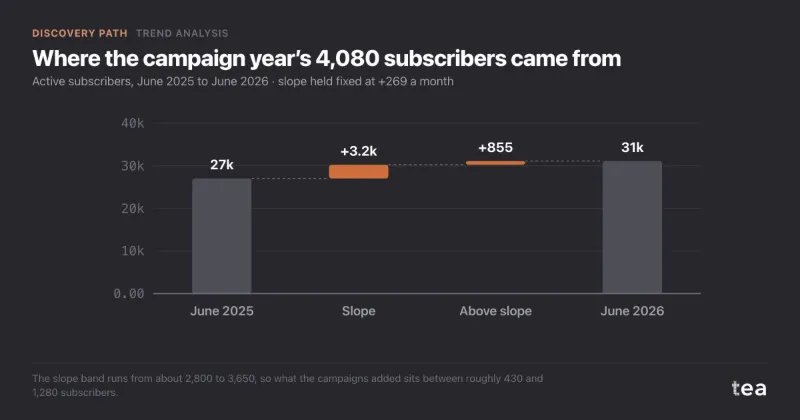
Slope before any campaign+269 a monthfitted on 24 months, no paid media
On the slope anyway3,225of the 4,080 gained in the campaign year
Cost per subscriber above it€533not €112, against €420 of margin

A coffee subscription in the Netherlands and Belgium, from the first example below. A composite case: your file draws its own line, with its own p-value.

01

What it is for

Most numbers in a business move on their own: word of mouth, a category that grows, a habit that spreads. The trend is the part of the movement nobody bought, and anything measured without it is measured against zero.

Telling growth from what was coming anyway

Before a campaign gets credit for a rise, draw the line the business was already on. What sits on it was on its way. Only what sits above it is anyone’s to claim.

Comparing before and after a change

A rebrand, a new price list, a new team. Run the slope on each side of the change and see whether the trajectory moved, or only the story about it.

Setting the floor of a plan

“Last year plus 8%” hides a guess about what the business does on its own. The slope makes that guess a number, and a target can be argued against it.

02

How to read it

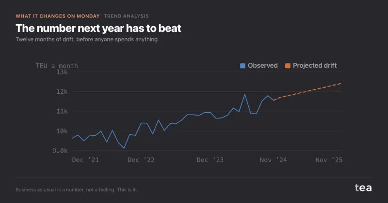
Four numbers, the line through the history, and what the line missed. The block below is the freight sample anyone can download: 59 months of import volume. Read the numbers in this order.

Import volume, TEU a month
Model Fit (R²) 83.6%1 Historical Slope 67.182 P-Value 0.0053 Significance Significant4

Structural Trend Extraction

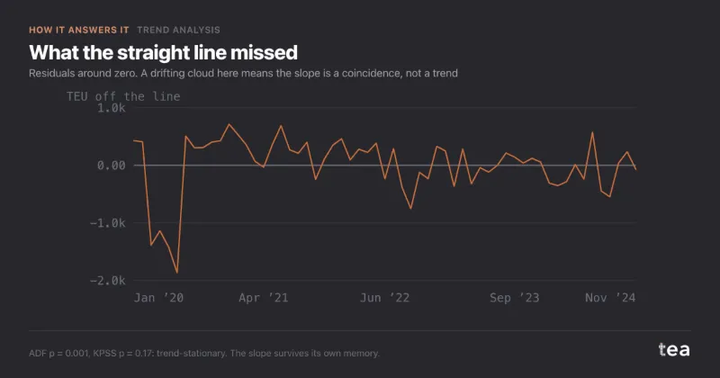
Residuals

  1. The fit, R². The share of the movement the straight line accounts for. 83.6% says this business is mostly its own momentum. It is not evidence that the slope is real: a series that wanders with no direction at all can still score high.
  2. The slope. The average change per period, in the unit of your KPI: 67 more containers every month. It is the number you carry forward, and the only one of the four with a unit.
  3. The p-value. Whether the slope can be told apart from a flat series. It is computed with standard errors that allow for neighbouring months moving together, so it comes out larger, and more honest, than a plain regression would print.
  4. The verdict. The p-value read at 5%. When it says Not Significant, the line still describes the stretch you uploaded. It is not a direction to plan on, and the cards above the chart say why in plain words.

03

Where it sits in the analysis

Trend Analysis opens the Discovery Path, the path for when something moved and five people have five theories about why. It goes first because the slope is the one driver that never asks for credit, and every analysis after it would quietly take it.

What you carry into the next step is one number, the base slope, held fixed. Seasonality is then measured around it, and the decomposition hands out only what is left above it.

When the next question is the number a plan has to beat rather than the slope behind it, Baseline Forecast projects the series forward with its season in it.

Discovery Path

  1. Trend Analysis this page

    Reads the structural slope first, with its confidence band, so nothing that follows gets credit for it.

    Carries forward: the base slope, held fixed downstream

  2. Seasonality & Event Impact

    Separates the calendar from the campaigns. Christmas is not a media result.

  3. Contribution & Driver Decomposition

    Gives every driver its share of the KPI: media, promo, price, controls, week by week.

  4. Base vs Incremental

    Collapses the drivers into the split a CMO actually asks for, with the counterfactual year underneath.

04

Where it usually misleads

A straight line will fit anything, and the arithmetic is always correct. The mistakes are in what the line is asked to mean, and most of them look like confidence.

A step read as a slope

A new listing, a new store, a lost customer: the series jumps once and sits flat on both sides. One straight line has to tilt to reach both levels, and the one-off gain becomes a growth rate. Second example below.

When the series cannot be told apart from one that wanders, the slope is drawn but described, not certified, and the insight says so. Then cut the window at the change and run each side on its own.

An R² that sounds like proof

On a series that wanders with no trend at all, a straight line still explains a large share of it. A high R² beside a slope invites the sentence “the trend is strong”, which the R² cannot say.

R² and significance sit in separate tiles, and the verdict is tested on the slope itself, never read off the fit.

Months treated as independent

A plain regression assumes each period is a fresh draw. Months of one business are not: a good month tends to follow a good month. Ignored, that makes almost any slope look significant.

The p-value uses standard errors that allow for correlated residuals, with critical values calibrated by simulation for this case.

Too short to tell drift from noise

Below two years of monthly data, a series that drifts and one that oscillates look the same. A slope fitted to too few points, quoted without its caveat, becomes a forecast by the third slide.

Under 24 periods no significance is claimed and the insight says the series is too short; under 104 it says the declared 5% can be worth up to 18%.

The calendar inside the slope

A file that starts in January and ends in a December peak tilts upwards even if nothing grew. Over a short window the season leaks into the slope, and the slope then gets planned on.

Upload whole years, starting and ending in the same month, and run Seasonality next to separate the calendar from the drift.

An extrapolation read as a forecast

The line continued past the data assumes nothing changes and nothing repeats. It has no season and no interval, and it says nothing about how wrong it might be in month twelve.

The twelve periods beyond the history are labelled Extrapolated Trend and carry no band. For a number to plan against, run Baseline Forecast or Time Series.

05

Two examples

One file where the line changed a budget, one where a single line was the wrong tool. Both are useful results.

Helps

Subscription growth that was already there

A coffee subscription with about 31,000 active subscribers had run a year of podcast and social campaigns at €38,000 a month. Subscribers went from 27,020 to 31,100, and the head of growth asked whether doubling the budget would double the 4,080.

Two clean years before any campaign gave the slope: +269 a month. Held fixed through the campaign year it predicted 3,225 of the 4,080, so only 855 sat above it, roughly 430 to 1,280 across the band. €456,000 over 855 subscribers is about €533 each, against a lifetime margin of about €420. The doubling was withdrawn and a geo test planned instead.

Read the full case

Cost per new subscriber, two ways

€ of campaign spend per subscriber

Same €456,000, two denominators. Only the second one knows about the slope, and across its band it runs from €356 to €1,060.
Does not help

One trend line through two businesses

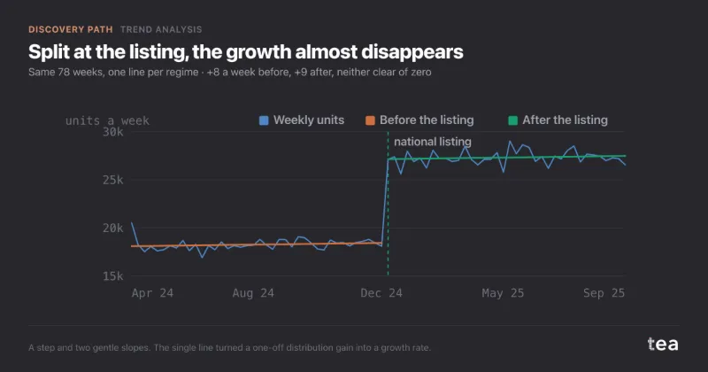
A UK crisps brand wanted to plan next year on its growth: about 175 units a week, every week, for 78 weeks. In week 41 a national grocer listed it, and stores went from about 600 to about 1,400. The file had no column for that.

One straight line gave +176 units a week and an R² of 0.75, and residuals in long runs of the same sign (Durbin-Watson 0.37). Split at the listing, the slopes were +8 and +9 a week, neither clear of zero. Extended twelve months, the single line projected about 38,600 a week against about 27,900 for the post-listing half: a plan 38% too high.

Read the full case

A step, and two gentle slopes

units a week, 78 weeks
  • Weekly units
  • One line, +176 a week
  • One line per regime, +8 and +9

The single line fits well and describes neither half. Its slope is mostly the jump.

06

What the charts add to the numbers

A slope is one number, and one number cannot show where it is wrong. The charts show the line against the history, and what the line left behind, which is where a missing step or a missing season shows up first.

Structural Trend Extraction

the history, the line, the extrapolation

Reads as: is the series climbing steadily, or does the line only average its way through? Grey is what happened, the solid line is the trend, and the dashed part is the same line carried twelve periods on. It is the chart for a board slide, with the caveat that the dashed part is arithmetic, not a forecast.

Residuals

what the line missed, month by month

Reads as: is what the line left behind just noise? On the freight file a dip in the first months sits far below the line, and after it the bars stay within a few hundred containers, small against a climb of about 3,900 over five years. It is the chart to check before the slope goes into a plan.

Residuals, on a staircase

the crisps file, one line through the listing
  • Above the line
  • Below the line

Reads as: what a missing variable looks like. The same chart on the second example: above the line at the start, below it in the weeks before the listing, a jump above it after, then a slow slide back under. Long runs of one colour are the signature of a step the file does not name. When this chart looks like a staircase, the slope beside it is not a growth rate.

tea, the product

Draw the line your business is already on

A CSV with a date and one number. The slope, its p-value and the residuals, in seconds, and a plain sentence when the series cannot carry a trend. Free while in beta, by invitation.

Request a place in the beta

tea, the product

Fifteen econometric analyses on your own CSV: Trend Analysis, saturation curves, elasticities, budget allocation. The diagnostics shown, and a plain sentence when the file cannot answer.

Free while in beta, by invitation.

Request a place in the beta →

Now run it on your own data.

tea runs Trend Analysis and fourteen other analyses on any weekly CSV, in minutes. Free while in beta, by invitation.

Join the beta