ea

Analyses/Discovery Path/Contribution & Driver Decomposition

What each driver really added, week by week.

Contribution & Driver Decomposition puts media, promotion, price, the calendar and the weather into one model, and hands each of them its share of every week. Each driver is credited only with what it did while the others were held still.

Answers What did each driver add to the KPI? Needs Weekly KPI, spend, price, promo and controls Hands back Contribution per driver per week, with diagnostics

A 34% summer spike, split by what built it

units a week from each driver, May to August 2025
  • Price cut
  • Heat
  • Influencers
The price cut19,000 units46% of the spike, a block
The heat15,000 units37%, following the thermometer
The creators4,000 units10%, interval 600 to 7,400

The six weeks after the launch of an iced coffee brand’s creator programme, from the first example below. A composite case: your file draws its own drivers, week by week.

01

What it is for

A KPI moves because several things moved at once, and each of them has a team that would like the credit. A decomposition gives every driver its share of the same weeks, in the units of the KPI, so the shares can be added up and argued with.

Explaining a number that moved

A spike that starts the week something launched is rarely that thing alone. The decomposition lists everything that started that week and says how much each one built.

Putting price and media on one chart

Price, competitors and a dull season take from the KPI as surely as media adds to it. A year in which media gave as much as price took looks flat in the accounts, and is not flat underneath.

Feeding the split and the budget

The contribution per driver, per week, is what Base vs Incremental collapses into one split and what Budget Optimization moves money with. A wrong split here travels all the way to the plan.

02

How to read it

Click a driver in any chart and its drill-down opens beside the page: the numbers that defend its share, then its contribution over the window. Read the p-value before the total.

Influencers
Total contribution 4.0k1 % of outcome 2.53%2 p-value 0.0213

Contribution over time

  1. Total contribution. What the model attributes to this driver over the window you selected, in the units of the KPI: units here, euros on a revenue file. The window filter moves it, so a six-week window answers a six-week question.
  2. % of outcome. The same total as a share of the modelled outcome in the window: 4,000 units of 158,000. When positive and negative drivers largely cancel, the Executive Summary moves to shares of gross movement and says so, rather than printing shares above 100%.
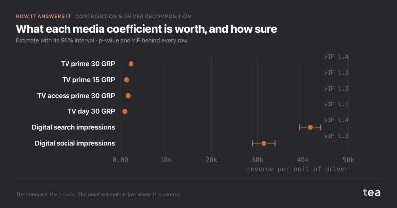
  3. The p-value. Whether the data can tell this driver from nothing. Under 0.05 the tile reads Significant, above it Not significant, and the bar in every chart is then a size without a proof. On a real run the coefficient sits beside it, and Model diagnostics adds its standard error, t and VIF.

03

Where it sits in the analysis

Contribution & Driver Decomposition is the third step of the Discovery Path, after Trend and Seasonality. The order is the point: the slope and the calendar are settled before any driver is credited, so that July is not handed to the campaign that happened to run in July.

What it carries forward is a contribution per driver, per week. Base vs Incremental collapses it into the split a board asks for. In the Media Effectiveness Path the same contributions, read with the carryover and the saturation fitted before them, are what the budget is moved on.

What the model hands back and how a run starts are on the marketing mix modeling page. This one is about reading the result, and doubting it.

Also a step of the Media Effectiveness Path.

Discovery Path

  1. Trend Analysis

    Reads the structural slope first, with its confidence band, so nothing that follows gets credit for it.

  2. Seasonality & Event Impact

    Separates the calendar from the campaigns. Christmas is not a media result.

  3. Contribution & Driver Decomposition this page

    Gives every driver its share of the KPI: media, promo, price, controls, week by week.

    Carries forward: contribution per driver, per week

  4. Base vs Incremental

    Collapses the drivers into the split a CMO actually asks for, with the counterfactual year underneath.

04

Where it usually misleads

A decomposition always adds up: that is how it is built. The problems are in which columns it was given and how they moved, and a split that is wrong looks exactly as tidy as one that is right.

Two channels planned together

When branded search bids go up every time TV goes on air, the file has almost no week in which one moved without the other. The model sees what the pair did and cannot divide it: drop a few weeks and the ranking flips. Second example below.

Every coefficient carries its VIF in Model diagnostics, with a warning above 4, and above 10 the waterfall says the split inside that group is unstable while the group total holds.

The thing you launched that week

A spike that starts with a new programme is credited to it, while a price cut and a heatwave started in the same week. A model can only share credit among the columns it is given: leave price and weather out and their effect goes to whatever is in the file.

Put price, distribution and the weather in the file as drivers before asking about the campaign, as in the first example.

A consequence entered as a cause

Branded search sits next to the sale and moves a few days after TV, because people who see the advert type the name. Entered as a parallel driver it takes the credit for demand TV created, and last-click reading confirms it.

Decide which drivers can cause which before the run, and enter the dependent one net of its cause, as in the branded search case.

Only the drivers that helped

Most reports count what media added and stop. Price, competitor pressure and a weak season take from the KPI too, and forcing them to zero quietly moves their effect onto the drivers that are left.

Negative contributions stay negative: they mirror below the zero line in Contribution over time and have their own column in Top drivers.

A bar without its error

A contribution chart is a set of point estimates. A large bar can belong to a driver the data cannot tell from nothing, and its size says nothing about whether it is real.

Each driver’s drill-down carries its p-value, marked Not significant above 0.05, and the coefficients table adds the standard error and t.

Twenty drivers on two years

With many drivers and few weeks the model fits history closely and divides the credit almost at random. An R² of 0.99 proves the fit, not the attribution, and it is easiest to reach exactly when the split means least.

Before the run, the file is measured in periods per estimated quantity and a thin ratio is printed above the result. After it, an R² under 0.55 turns the summary into a reading of direction, not a basis for reallocation.

05

Two examples

One file where the drivers had moved apart often enough to be told apart, and one where they never had. Both answers were worth having.

Helps

A summer spike credited to influencers

A UK iced coffee brand launched its first creator programme in the week of 16 June 2025: twenty accounts, about £40,000 for the summer. Over the next six weeks units ran 34% above the spring, and the brand manager asked to triple the programme. In the same weeks the largest grocer cut the price from £2.10 to £1.85, a 12% cut, and the summer was one of the hotter ones.

Earlier summers had heat without promotions and earlier promotions ran in cooler weeks, so 130 weeks let the model tell the three apart. Of the 41,000 extra units, the price cut built 19,000, the heat 15,000 and the creators 4,000, with an interval from about 600 to 7,400. At £2.10 a bottle that is about £8,400 of retail revenue for £40,000 of fees. The tripling was dropped, and the programme renewed at the same budget as brand-building.

What the creators returned against their fee

retail revenue over the six weeks, £

41,000 units at £2.10 is £86,100. The measured 4,000 is £8,400, and even the top of its interval, about £15,500, stays well under the fee.
Does not help

TV and branded search, one variable

A French mattress brand, around €31M of online revenue, wanted one number for TV and one for branded search before the budget round. During every TV flight the search agency raised bids on the brand name, so across 104 weeks TV GRPs and branded search spend correlated at r = 0.93, and the VIF on both came out at 7.8.

The point estimates said €1.40 per euro for TV and €1.90 for search, but each interval crossed zero: −€0.30 to €3.10, and −€0.80 to €4.60. The pair together returned €1.53, from €1.27 to €1.79. Remove eight weeks and the ranking flipped. The answer was to report the two as one block, and to break the bidding rule for the next two flights so that each channel moves on its own.

Two intervals across zero, one that is not

€ of revenue per € spent, 95% interval

Each channel’s interval contains the other’s estimate. The sum is known to within about 26 cents; the split is not.

06

What the charts add to the numbers

A decomposition is a table of drivers by weeks, far too large to read as a table. Each chart answers one question a planner brings to it, and a click on any bar or band opens the drill-down behind it.

Total contribution by driver

a sample market, one year, €

Reads as: which levers moved the window, ranked from most positive to most negative and coloured by group. The structural baseline is muted here, as a click on its name does in the product, so that the levers can be read at all. Price is the bar most reports leave out.

Waterfall · What moved the total

December against March, by group, €k

Reads as: what changed between two periods you pick, group by group: right when a group added, left when it took. The bars sum to the model’s net change, +€42k here, and whatever the model cannot explain is reported apart, never folded into a driver. It is the chart for “why is December up on March”.

Contribution over time

the same market, 52 weeks, €k a week
  • Baseline
  • Seasonality
  • Media
  • Promo
  • Price
  • Controls

Reads as: which drivers are structural and which pulse. Positive groups stack above the zero line and negative ones mirror below it, so a flat total over a busy chart is two forces cancelling, not a quiet year. The flights show as ridges, the promotions as spikes, and the mid-year price rise as a step down below the line.

tea, the product

Split your own KPI by what drove it

A CSV with a date, a KPI and its drivers. The contribution of each one, week by week, with the diagnostics beside it, in minutes, and a warning when two drivers cannot be told apart. Free while in beta, by invitation.

Request a place in the beta

tea, the product

Fifteen econometric analyses on your own CSV: Contribution & Driver Decomposition, saturation curves, elasticities, budget allocation. The diagnostics shown, and a plain sentence when the file cannot answer.

Free while in beta, by invitation.

Request a place in the beta →

Now run it on your own data.

tea runs Contribution & Driver Decomposition and fourteen other analyses on any weekly CSV, in minutes. Free while in beta, by invitation.

Join the beta