ea

Analyses/Pricing & Promo Path/Scenario Simulation

Run the plan before you sign it.

Scenario Simulation runs the next half-year twice on a fitted marketing mix model: once as business as usual, once with the drivers you plan to move. Every answer comes with its range, and with a flag where the plan goes beyond anything the file has seen.

Answers What does this plan do against business as usual? Needs Over a year of weekly KPI and its drivers Hands back Change with P10 to P90, by driver, range flags

Three curves that agree on every week you have spent

orders a week from media, against media spend a week
  • Fitted
  • Steeper, fits as well
  • Flatter, fits as well
As printed+10.8%orders, P10 to P90 +8.9% to +12.6%
Across curves that fit6.2 to 15.1%the same weeks, three shapes
Cost per extra order€62 to €152the number the decision hangs on

The furniture retailer of the second example below. A composite case: on your file every week a plan takes past the observed range is flagged, and the summary counts them.

01

What it is for

A plan is a set of changes to last year, and every change has an effect the model has measured. A scenario adds them up week by week, carryover and saturation included, against the year you would have had without them.

Defending a cut, or an increase

Fifteen per cent less media against business as usual: how much revenue each euro saved gives up, with its range. The answer exists before the budget round instead of after it.

Choosing between two plans

Every run is kept on the page. Two calendars, two splits, two levels of spend are compared on the same model and the same business as usual, so the difference is the plans, not the method.

Finding the lever that matters

Each driver alone, a tenth lower and a tenth higher. The ranking often surprises: the lever that moves the answer most is not always a media decision.

02

How to read it

The Executive Summary opens the results: four tiles and a headline written from them, above the forecast. Read the last tile first.

Double media
Change in orders +25,2201 P10 to P90 +20,780 to +29,4202 Per €1k spent 11.43 Outside observed range 34

Orders under this scenario

  1. Change in orders, P50. The median of 1,000 simulated outcomes, minus business as usual, summed over the 26 weeks ahead. It is in the unit of your KPI: orders here, euros when the KPI is revenue.
  2. P10 to P90. The central 80% of those simulations. It covers the uncertainty in the coefficients only: carryover and saturation enter as if they were known, so the real range is wider, and the page says so under the forecast.
  3. Per €1k spent. Extra orders for every €1,000 of extra media, at the median. On a revenue KPI it becomes Implied ROI, judged against a 30% gross margin. On a cut it becomes what each euro saved gives up, and on a pure reallocation it says Reallocation, because there is no extra spend to divide by.
  4. Outside observed range. How many drivers the plan takes past the levels in the history, by more than a tenth of their range, and in how many weeks. Those weeks turn grey on the forecast. Above zero, part of the answer is a curve extended rather than a curve observed.

03

Where it sits in the analysis

Scenario Simulation is the last step of two paths. In the Pricing & Promo Path it runs a price and promotion calendar; in the Planning Path it bends the business-as-usual forecast with a decision. It comes last in both because a scenario is only as good as the effects it moves, and the steps before it check those effects one at a time.

It carries nothing further, because a scenario is where a path becomes a decision. What it hands on is a choice between plans, every one kept on the page, and two suggestions: Budget Optimization to find the allocation you had not thought of, and Saturation Curves before pushing a channel past its observed range.

The model underneath is the marketing mix model of Contribution Decomposition: geometric adstock and a Hill curve on every media driver, one regression. Scenario Simulation fits it once, then asks it questions.

Also a step of the Planning Path.

Pricing & Promo Path

  1. Price Elasticity

    How demand answers a price move, with the confidence band and the revenue curve.

  2. Promo Elasticity

    The incremental lift of the promotions, net of the demand that was coming anyway.

  3. Cross-Elasticity

    Whether the competitor move takes your volume or leaves it alone.

  4. Scenario Simulation this page

    The price and promo calendar you are considering, run against all three elasticities at once.

04

Where it usually misleads

A simulator always answers. The question is how much of the answer the file stands behind, and the band alone does not say.

A plan beyond the spend you have seen

Doubling media puts almost every week of next year above the highest week ever run. There the shape of the curve is the whole question, and three shapes that fit the history equally well give anything from 6.2% to 15.1%. Second example below.

Weeks where a driver leaves its observed range by more than a tenth of that range turn grey, the Outside observed range tile counts them, and the headline says that part of the answer is extrapolation.

The band taken for all the uncertainty

The P10 to P90 band comes from drawing the coefficients 1,000 times. The decay and the bend of each curve are held fixed. Inside the data that is a fair simplification. Outside it, the bend is the part that matters.

The note under the forecast says what the band covers, and that the real range is wider than the one drawn.

Business as usual that nobody chose

Every scenario is a difference from business as usual, and business as usual is last year’s plan repeated week by week, with the trend continued. If last year had a dark summer or a one-off launch, so does the comparison, and a scenario that adds media in those weeks is partly undoing last year.

The first run on the page is business as usual on its own, and its headline states the rule. If last year was not a normal year, say so beside every number you quote.

A channel that lowers the KPI when it grows

With correlated channels, one can come out of the fit with an effect that is not positive. Raise it in a scenario and the KPI falls, which reads like a bug, or worse, like a finding.

Such channels are named in the notes before anything is run, and on a revenue KPI the channel’s marginal return warns that the model probably cannot separate it, so its sign is not to be planned on.

A month spent on the wrong lever

Teams argue for weeks over the split between two digital channels while a price decision taken elsewhere moves five times as much. A scenario built on the small lever is precise about something that does not matter.

The Sensitivity chart moves each driver alone, 10% down and 10% up, so the levers are ranked before the scenario is designed.

A gain the range cannot tell from nothing

A quarter of the budget moved from Meta to Google came out at +60 installs a week, with a range from −144 to +258. A small gain is the likeliest outcome and a small loss is not ruled out. Built into a target, it is a miss waiting to happen.

When the central 80% of simulations runs from a loss to a gain, the Change tile says so: on this evidence the scenario cannot be told apart from doing nothing.

05

Two examples

One calendar the simulation changed, and one plan it could only half answer. The second answer was still worth having.

Helps

The promotion wave worth dropping

A household-goods maker: a one-litre washing-up liquid in Italian grocery at €3.66, about 42,000 bottles in an ordinary week, a unit cost of €2.20. The retailer’s plan for March to August had five two-week waves at 25% off, and the agreement allowed four. The question was whether anything in the calendar would be regretted.

Run week by week with the brand’s price, its promotions and the category leader’s promotions in the model, the five-wave plan came to about 1.24M bottles and €1.23M of margin. Wave 3 fell on the leader’s mid-May promotion and on the dip after wave 2, and added about 12,000 bottles against 37,000 for wave 5. Dropping it cost 1.0% of volume and added 6.0% to margin, about €73k. Four waves were signed, the mid-May one removed.

Which wave to give up

season change against the five-wave plan, with its interval

Both cuts save margin, because every 25% wave loses it. Only wave 3 does it with a volume loss whose interval includes zero, which is what the retailer reads.
Does not help

Doubling media, past the last week observed

An online furniture retailer in Germany, about 9,000 orders a week from three paid channels. Over three years, total media had moved between €40k and €118k a week, around €85k. A new owner asked what doubling media next year would do to orders.

The simulator printed +10.8%, P10 to P90 from +8.9% to +12.6%, and flagged almost every week of the horizon as outside the observed range. Three curves that fit the history equally well gave 6.2% to 15.1% at the doubled spend, and a cost per extra order from €62 to €152. The +25% scenario, at +3.5%, stayed inside the data. The advice was to step up by a quarter, or double spend in a few regions, and read what comes back.

The number printed, and the one it cannot carry

change in weekly orders against business as usual

The printed range covers the coefficients, with the shape of each curve taken as known. Past the data, the shape is the uncertainty.

06

What the charts add to the numbers

A scenario is one difference between two lines. The charts say which levers it rests on, where it comes from, and how much of it the history has seen.

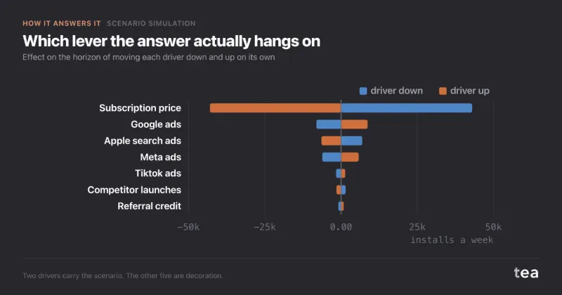
Sensitivity

each driver alone, 10% lower and 10% higher, mobile app sample
  • Driver 10% lower
  • Driver 10% higher

Reads as: which levers the answer depends on, before the scenario is designed. Here price moves about five times what the largest media channel does. A media bar pointing the wrong way, as Apple search ads does, is the model failing to separate that channel, and the notes say so.

From business as usual to scenario

change in orders over 26 weeks, doubled media, by channel

Reads as: where the change comes from, driver by driver, on its way from business as usual to the scenario. It is the point estimate, so it is the chart for explaining a scenario rather than defending it: the range is on the tiles and around the forecast.

Observed range

for each channel, the weekly spend in the history and where the scenario puts it
  • Observed in the history
  • Business as usual, typical week
  • Scenario, typical week

Reads as: which drivers the plan takes somewhere new. The bar is everything the history contains. A dot above it is a level the model has never seen, and the result for that driver is the curve’s formula rather than its evidence. It is the chart to show before anyone quotes the headline.

tea, the product

Test the plan before the budget is signed

A CSV with a date, a KPI and the drivers you plan to move. Business as usual, every scenario with its range, and a plain flag when a plan goes past your history. Free while in beta, by invitation.

Request a place in the beta

tea, the product

Fifteen econometric analyses on your own CSV: Scenario Simulation, saturation curves, elasticities, budget allocation. The diagnostics shown, and a plain sentence when the file cannot answer.

Free while in beta, by invitation.

Request a place in the beta →

Now run it on your own data.

tea runs Scenario Simulation and fourteen other analyses on any weekly CSV, in minutes. Free while in beta, by invitation.

Join the beta